Showing posts with label 1930s. Show all posts

Sunday, September 30, 2018

Doc Savage Covered (1938)


(1933) (1934) (1935) (1936) (1937) (1938) (1939) (1940) (1941) (1942) (1943) (1944) (1945) (1946) (1947) (1948) (1949)


To the world at large, Doc Savage is a strange, mysterious figure of glistening bronze skin and golden eyes. To his amazing co-adventurers--the five greatest brains ever assembled in one group--he is a man of superhuman strength and protean genius, whose life is dedicated to the destruction of evil-doers. To his fans he is the greatest adventure hero of all time, whose fantastic exploits are unequaled for hair-raising thrills, breathtaking escapes and blood-curdling excitement.


More Doc Savage today. (Woo!)

From previous posts, you already know:
  • I'm going through all 181 Street & Smith pulps (by year of pulp publication) and their corresponding Bantam reprints. (The pulps were originally published between 1933 and 1949, and the reprints between 1964 and 1990.)
  • Emery Clarke and Walter Baumhofer painted the lion's share of pulp covers, and James Bama and Bob Larkin did most of the paperback artwork. (And of course, Lester Dent did most of the writing.)
  • Book blurbs you see are from the reprints--the pulps only had three or four-word cover descriptions--along with slightly longer ones inside under the story's title--but nothing remotely as blurb-tastic as the reprints came up with later.
  • As far as commentary goes, I'm not doing a ton of it for each cover, but whenever something catches my fancy, I (usually can't help but) mention it.
  • You can click through most covers to see larger versions, using your browser's back button or keyboard shortcut to get yourself back to the full post.
Okay then: "1938 awaits!" (Spoken with deep, eerie and echoey voice--natch.)


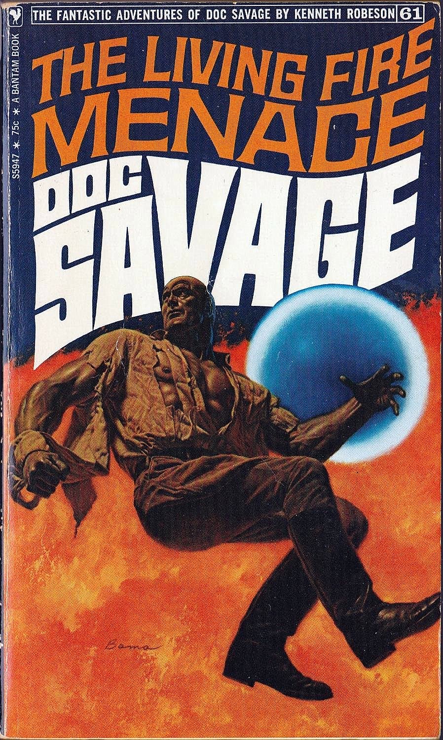
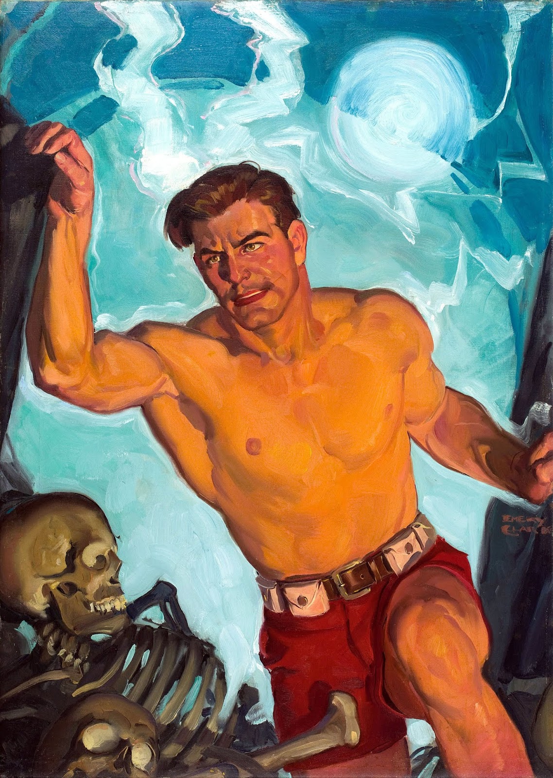
The Living Fire Menace (January 1938 and June 1971) by Harold A. Davis & Lester Dent

Nations arming for international conflict engage in a behind-the-scenes mineral war that threatens to disrupt the natural balance of the universe. The Man of Bronze rises to the titanic peak of his strength and wit to uncover the secret of the cavern with the living fire!

Artist: Emery ClarkeArtist: James Bama

Well, that blurb starts out pretty run-of-the-mill: international conflict, mineral war--could be talking about any number of paperbacks there on the rack. Then we hit "...disrupt the natural balance of the universe..." and we're like "oh, must be a Doc Savage adventure."

And there have been mornings, after an especially late night, when I've had to rise to the titanic peak of my strength and wit to roll out of bed in a timely manner. I'm just saying I've been there, and that "titanic strength and wit" are things Doc and I have in common.

(Now on to these two covers, he wrote titanically!)

Hmm. Covers. You know I'm a fan of Bama's Doc in general--his sheer size and musculature are so impressive to me. But BamaDoc abstractly floating over a field of orange fire next to a big blue bubble? ... Meh.

On the other hand, Clarke's Doc amounts to a really nice figure study--obviously not sporting larger-than-life musculature like Bama's, but it's one extremely well-rendered figure by any standard you care to hold up. I'm sayin' it speaks (loudly, so it's kind of shouting) to the artist in me. I also like that firelight reflecting off Doc's skin. And I like that, dressed in nothing but his little red skivvies, Doc's remembered to bring his utility belt along.

And--hello--skeletons! Skeletons ALWAYS garner big points on a pulp or paperback cover, amiright? I mean, double points for LIVING SKELETONS, and these bones are clearly just lying there, but still: 800 Skeleton Points. Yeah, clear winner here.

In fact, just for fun, I'm throwing in an image of Clarke's original painting. Go ahead and click through to take a gander at his work, all up close and personal. Nice, nice stuff.


The Mountain Monster (February 1938 and September 1976) by Harold A. Davis & Lester Dent

The monster came without warning. It came as Indian legend had said it would come, in the night and while a storm raged. It brought terror and horror to peaceful Arcadia Valley. It transformed an Alaskan paradise into a panic-stricken, fear-blanched hell. Only one man could stop it — the Man of Bronze.

Artist: Harold Winfield ScottArtist: Boris Vallejo

Oh how I wanted that giant spider to be real when I first read this one as a kid. First encounter I had with the story was through the Bantam reprint, and man, what a cover! I mean, if Doc can end up in a lost valley filled with honest-to-god dinosaurs, he should be able to meet up with a real live giant spider as well, right? But no, this monster is (yet another) Scooby-Doo contraption built by bad guys to scare off the honest folk. Sigh.

And it is the spider that brings all the joy, on that Bantam cover. I don't remember if I've mentioned (it's taking me so long to get through these year-at-a-time posts), but being quite a fan of Boris Vallejo's work otherwise, I'm not so overcome by his Doc-renditions. (Shrug.)

But hey! A new artist has popped up on the pulp side of things! Click through the link on Mr. Scott's name (just underneath his pulp cover) for a little background info on the man. Apparently this is his one and only Doc cover, and I like it. I mean, clearly I can't place it above anything with a giant spider on it, but this is an interesting, engaging cover in its own right. Well done, Mr. One and Only.

GIANT SPIDER! Mmmmm....


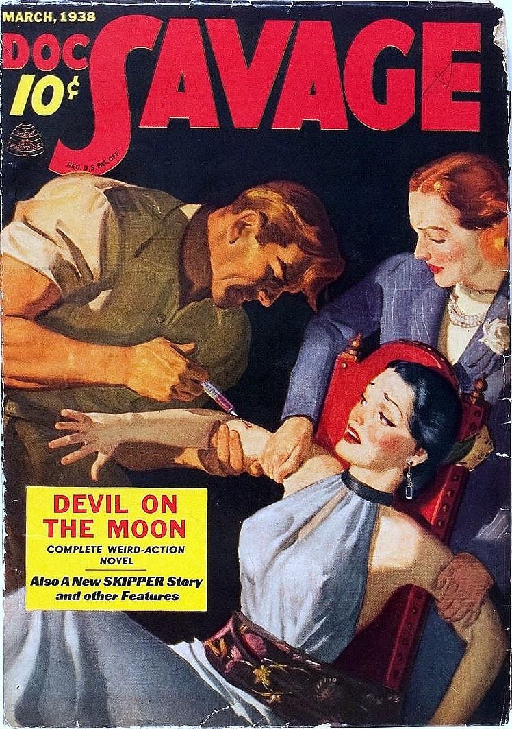
Devil on the Moon (March 1938 and July 1970) by Lester Dent

A fiery red flash bursts through the silence of the night … a dying green man insists he’s been held captive on the moon .. a small blue capsule conceals an unearthly medallion. Can the invincible Man of Bronze piece together this weird puzzle in time to save the world from the devilish merchants of international war?
Artist: Emery ClarkeArtist: James Bama

I honestly don't remember if this story actually involves someone masquerading as a devil, but it does involve a group of evil-doers tricking folks into thinking they're being held captive on the moon. At any rate, looks like Bama just took the book title and painted it. A little fanciful for me (says the guy who raved about a cover's giant spider just one book back), but okay.

Gotta say I prefer Clarke's cover this time around--nothing overly exciting about it, to be sure--it's just that I prefer Doc and Pat dosing up a Bad Gal with (I assume) truth serum, to Looming Red Devil Guy. Nice to see both Doc and Pat on a cover together. I wonder how many times that happened? (Nope, I'm not going to go back and count.)

But you know? I like this story's title. It's a tiny bit outside the usual formula used for the series. You know, The _____ Mystery, or The _____ Ghost, etc. Mysteries and ghosts were very popular at the Doc Savage Titling Office.

Yeah, I like it.


The Pirate's Ghost (April 1938 and July 1971) by Lester Dent

At his supersensational best, the Man of Bronze finesses an international band of modern day pirates in possession of the master invention by the Mad Genius of Death Valley!

Artist: Emery ClarkeArtist: James Bama

And speaking of ghostly titles, there was one published the very next month! (Insert mysterious melodic trilling sound here.)

Okay, I like that this blurb uses the word "supersensational" and I pulp-honor it for that, but overall it's gotta be the lamest Bantam blurb so far (alas, another thing I'm not gonna go back and actually check on). I'm not wrong though, am I? The blurb's a snoozer.

And again, nice Doc on that Bama cover, but Big 70s TV Movie Pirate Guy is doing me no favors. None at all. I feel like he could start selling me cereal at any moment. Blech.

Clarke's cover is doing me a few favors, though. It's not changing my life, but there are small-to-medium-sized favors happening. I like the image overall, nice lines and composition. Wee fishes on the bottom right are a nice touch. Kind of an "X" going on visually, with Doc's body making one half and the anchor chain and fishes the other. I like the knife between the teeth too--kind of a cliche, but where else would you hold your knife if you needed both arms to swim?

It's just a more interesting cover for me, over all.

Nuff said.


The Motion Menace (May 1938 and September 1971) by W. Ryerson Johnson & Lester Dent

The Man of Bronze and his cousin Pat face an inordinate challenge: a machine that makes all modern weapons worthless. A gang of international thieves in control of the invention are shooting high: World Control.

Artist: Emery ClarkeArtist: James Bama

World control?! Those bastards!

Okay, Bantam covers haven't been faring well this time around, but I'll come right out and say I prefer this Bama cover to Clarke's. I'll also say it's the dirigible we're seeing in the background that put's the cover ahead in my book. (Heh. Get it? We're talking about books and I said "in my book." Heh.) Anyway, dirigibles are extremely cool, plus they have a name that is incredibly fun to say out loud, and I just like them, and that's why the Bantam cover wins here.

As for Clarke's cover, no real complaints, there's just not a lot going on in it to keep me interested. Is that a parachute that Doc is sitting on? Were those a thing, back in the day--you sat on your parachute? Hmm. You know, I'm reasonably sure that's a dirigible way down in the cover's bottom right. Are we looking up into the sky at Doc having just jumped out of an exploding dirigible?

I don't know, and maybe that's part of the problem with this one for me. I don't generally want to have to puzzle out what's going on in a pulp's cover--just pull it out and hit me over the head with it, already.


The Submarine Mystery (June 1938 and August 1971) by Lester Dent

It might be a hoax, and it might not be. Blood has been spilled! People are dead! The Man of Bronze ably confronts a dangerous crackpot scheme that has a baffled world wondering what will happen next.

Artist: Emery ClarkeArtist: James Bama

Well, if blood has been spilled and people are dead, I'm guessing it's not a hoax....

As for these two covers, I am seriously enamored with Bama's. Why? Take one look at his bursting-to-the-surface submarine and you'll know why. Submarines are right up there with dirigibles, as far as pulp-paperback-cover-coolness goes. (Pulp-paperback-cover-coolness is a technical publishing term--very big in the publishing world.)

Now if the corresponding pulp also had a submarine on its cover... we might have a closer contest. I guess Doc and damsel might be inside a submarine on Clarke's cover there, but sub-insides are not in the same league as sub-outsides, cool factor-wise.

So yeah, sub breaching at the surface wins hands down.

Hmm. Awfully shallow water BamaDoc is standing in. Must be a nice, deep ocean trench just behind him. Otherwise how would he be standing thigh-deep with that big old sub coming up hard enough to pop its prow (do subs have prows?) like that?

Yeah, gotta be a trench back there. That sub was probably running from a megalodon. (amiright, Steve Alten fans?) Sigh. And now, having brought a completely unrelated idea up, I'm compelled to include this megalodon size chart, totally out of the blue and courtesy of Fossil Guy. (Click through the image to ginormicise so you can fully appreciate it. Fossil Guy did nice work.)


Damn, that megalodon would SO dominate our oceans today. But I digress. On to Doc's next novel.


The Giggling Ghosts (July 1938 and January 1971) by Lester Dent

Fears of ghosts and a deadly giggling gas become a terrifying reality to millions of people threatened by the S.R.G.V. The Man of Bronze faces a supreme test as he pits might against the forces of evil.

Artist: Emery ClarkeArtist: James Bama

Okay, I am flat out enjoying PulpDoc in that sweater vest. Never mind he's keeping it cool while hanging from a skyscraper, unconscious woman in-hand--he's doing it all while rocking his late-thirties-business-casual to boot.

BamaDoc, on the other hand, is all locked, loaded and ready to kick ass in yet another ruined shirt. He looks supremely ready to take on every last one of those Shadowy Bad Guys lurking about in his cover's background. And, there will be NO GIGGLING INVOLVED should any ass-kicking take place--that mask Doc is wearing ensures he will be well defended during any "deadly giggling gas" attacks.

Yeah, it's a decent Bantam cover, but PulpDoc and his sweater vest take the deadmansprize here. (Now you're wondering what a deadmansprize is and if you can get one.)

Does this story involve laughing gas, as in the actual dentist-thing? (What's it called, CO2?) Ah, Google tells me it's C2O, and since it was around well before the 1930s it could be a factor in-story. Can't honestly say I remember a darn thing about this book's plot-line, and... a quick look at my own collection says I don't have this one available to thumb through, so we are just out of luck on that count.


The Munitions Master  (August 1938 and March 1971) by Harold A. Davis

Screaming trunks of soldiers seared by white-hot fire … a small, twisted man carrying long loaves of bread … a thin liquid with a peculiar sickening smell … Branded the worst traitor in history, the Man of Bronze fights through the flames of revolution to uncover the master of a world of the Living Dead!

Artist: Emery ClarkeArtist: James Bama

Wow, that is quite a cover blurb we've got going here.

I'm not even sure what a screaming trunk of soldiers refers to. A large container full of screaming enlisted men? Or is the container itself screaming? Or are we talking multiple enlisted men sans arms and legs, all tossed into a big box? I truly have no idea. (I had to go to a couple different sources on that blurb to make sure I wasn't looking at a typo. I wasn't. "Screaming trunk of soldiers" is the real deal.) Anyway, add small twisted men, long bread loaves and the living dead into the mix... that's gotta be quite a story.

As an aside, Harold Davis was apparently known for putting together some of the more outlandish of Doc's adventures, and while I've read them all at least once it was before I'd looked into things such as who wrote what, so I'm not the man to ask on that score. But I'll say that THIS is a Harold Davis story, and it sounds fairly over the top to me, so the Harold Davis theory is not disproved here.

As for these two covers, BamaDoc encased in ice is the winner for me. It's just a cool (*NPI) image. The pulp cover is decent too, but not over-inspiring. (Is it even possible to be overly inspired? That's like being too beautiful, or having too much peanut butter. Not sure you can really do that.)

*No Pun Intended

Regardless, the Evil Guard on Clarke's cover is surely about to get what's due him. We know he's evil because he's wearing red and has a goatee. Plus, he's cowering in the face of Righteous Courage. Wait, maybe he's only cowering 'cause he's about to get clocked by an angry bronze giant. Or maybe it's both.


The Red Terrors (September 1938 and July 1976) by Harold A. Davis

The Red Terrors — they came out of the depths to seize an unsuspected ship and transport its precious human cargo to their watery domain. There, in a lost sunken world under the sea, they lived securely. Until they sank the wrong ship … and the Man of Bronze came to call.

Artist: Emery ClarkeArtist Boris Vallejo

Hmm. Well, that Vallejo cover does nothing at all for me. His Red Terror looks like the Vulture, of whom I have never been a fan. (I thought Micheal Keaton did a nice job with that latest re-imagining, though.)

Clarke's cover definitely wins out for me this round. Nothing epic about it, to be sure, but it's at least delivering the goods as far as pulp action is concerned--being trapped in a room rapidly filling with water is not to be sneezed at. (...shudders...) What a way to go.


Fortress of Solitude (October 1938 and April 1968) by Harold A. Davis

The deep mysteries of Doc Savage are finally revealed! John Sunlight, poetic genius of evil, gruesome master of a thousand elements of screaming terror, discovers the innermost secrets of The Man of Bronze. Doc Savage finds himself enmeshed in a diabolical web of dark horror as he valiantly battles the appalling machines of destruction he himself has invented!

Artist: Emery ClarkeArtist: James Bama

You know, I think it's time I gave this one a second read-through. Pretty sure I only read it the one time, when I was going through all 181 stories.

Have I mentioned yet how I managed to do that? It was back in the day of PalmPilots. I was working nights, with a lot of nothing-to-do-but-must-stay-awake-at-all-costs time on my hands, and I'd come across a website with all 181 of Doc's adventures in .pdb format. On to my Palm they went and I got through all of 'em in about six months as I recall.

Of course my Palm and its files are long gone now, but that's how I got through all the adventures without actually having books-in-hand. These days, copyright holder Conde Nast is pretty quick to quash any electronic Doc Savage files they find lurking about the web, so I'd be surprised if you could get a hold of anything similar now. Too bad.

Anyway, as it turns out I do own a physical copy of this particular story, and so I gave it an airplane-read on the business trip that happened between that first paragraph up there and this one (life happens between paragraphs). The biggest standouts for me in the book were 1) how evil this book's villain was portrayed as being--he was a truly horrifying figure--frighteningly so, and 2) all the references to Doc as a very human character.

What I mean by that second point is this. Doc (especially earlier on in the series) is invariably painted as being very close to superhuman, physically and psychologically. He's always in control of himself and the situation. He never voices concern for his own safety, or really expresses any emotion at all. But in this story, instances of Doc's humanity are called out several times. Here are a few of 'em:
  • "Doc Savage was a normal fellow who... was rather unusual but still human enough. He had missed the play-life of normal children, and so he was probably more subdued, conscious that he hadn't gotten everything out of life. Talk... attributed all kinds of fantastic doings and powers to Doc Savage. But it was only talk."
  • The bronze man's powers of observation had been trained from childhood.... He had to notice little things... if he wanted to go on living.
  • "How did you figure that out?" Ham demanded. (Doc's aides were generally quite subservient, almost seeming to hold Savage in awe. Hard to imagine one of them "demanding" anything of him.)
  • [Doc's] face--they had never seen quite such an expression on his face before. It was something stark. Queer. They could not, at first, tell what it was; then they knew that the bronze man was feeling an utter horror.
  • Doc Savage had spun, and flung [himself] into the library. The bronze man snapped the library door shut behind him, then did nothing more exciting than stride to one of the great windows and stand stiffly, staring into the hazy northern sky. Doc's sinew-cabled arms were down, as rigid as bars, at his sides, and his powerful hands worked slowly, clenching and unclenching. He was doing something that none of his men had ever seen him do before. He was taking time out to get control of himself.
  • [Doc] never criticized his crew for errors or shortcomings. The bronze man made mistakes himself. Mistakes - his metallic face settled into the grimmest of lines. Mistake! This whole thing was the result of a mistake he had made. A horrible error. He had not told them that as yet, but the fact had taken shape in his own mind, and was there whenever his thoughts relaxed, to torment him like a spike-tailed devil.
Got some nice Ken Barr
cover art going on here.
So yeah. A horrified, out-of-control, tormented Doc is not the norm for this series. I do remember that Philip Jose Farmer, in his (excellent) book Doc Savage: His Apocalyptic Life, talked about Doc losing some of his superhuman self-control as the series progressed. He called out The Lost Giant and several other books as examples, but I don't think he mentioned this one.

Oh, wow. We're 13 paragraphs in on these two covers, and I haven't weighed in on the artwork yet. Oops. Well, fun as the actual story was, neither one of these covers does a lot for me. Nothing wrong with either of them, they're just not getting my heart rate up at all. I guess if I had to go with one, it'd be... um....

Huh. I guess it's a tie. Weird. How often does that happen? (Not very often, if memory serves....)


The Green Death (November 1938 and November 1971) by Harold A. Davis

From Matto Grosso — in the deadly heart of the Green Hell — comes an organic mystery that paralyzes even the Man of Bronze: an oozing horror that wipes out the line between life and death!

Artist: Emery ClarkeArtist: James Bama

Eew. Oozing horror sounds too much like oozing sore and that's just gross. Let's see, we're almost to the end of 1938--this and one more month to go. So what's up for me with these two covers? Anything? Hmm. I'll say neither one stuns me.

Bama, as usual, has some nice dark-and-creepy going on in his cover. Nice image of Doc there, too. It looks familiar--I wonder if Doc was taken from an earlier cover and pasted into this cover's foreground. (Yet again, not something I'm going to research out.) I guess it's a pretty standard Bama-esque pose, though. Maybe that's all I'm seeing.

Anyway, I'm going with Clarke's cover this time. I'm liking the whole Doc tied to an alter thing going on there. Heck, you could swap Doc out for a certain member of the Greystoke clan and you'd have a Tarzan cover staring you in the face. Anyway, the more I look at the cover, the more I like it overall. Pretty iconic, priestess with raised dagger and the whole bit. Well done. Reminds me it'd be fun to do a Tarzan Covered post sometime....

Wow, is it me or does Doc have a particularly prominent nipple on display in Clarke's cover. (I'm not judging; I'm just asking.) 

On to this year's LAST COVERS.


The Devil Ghengis (December 1938 and December 1974) by Lester Dent

A fantastic horror has come out of the polar regions — a menace so bizarre it causes men to go insane! The Man of Bronze and his courageous crew penetrate the rugged Asian interior on a perilous mission: to find out the source of this mystery and smash the evil genius who controls it.

Artist: Emery ClarkeArtist: Fred Pfeiffer

That's gotta be Johnny, Renny and Ham staring down at a coffined Doc in that pulp cover, right? Cool to see so many of the main characters on a cover. I'll have to give this one a read as well (it IS the sequel to Fortress of Solitude, after all--villain John Sunlight was the only baddie to show up twice across all 181 stories. Anyway, if I give it a read I'll know exactly who's who on that cover.

I like the Clarke cover due to its being well-peopled--can't say there's a lot of action going on (there never is when the centerpiece is a coffin amiright?). But that Pfeiffer cover is really nice to look at, too. I mean visually it's a striking cover. Hmm. You probably know by now I'm not a fan of Giant Floating Head covers in general, but this one is a nice composition--maybe having Gengis' wrist and hand in there as well makes it less Floaty Heady.

Goin' with the old pulp though, on account of it having so many of the gang featured. (And if I read the story and find out I'm mistaken on who's who I may or may not remember to come back and update....)


And that's it! We are through with Nineteen Thirty Eight, in all its glory. 1939 is next (obviously), and it'll be the LAST 1930s cover set. Wow. I'll be curious to see how the pulp covers change (if they do) as we move through a new decade. I mean, certainly art in general, and commercial art in particular, has tended to reflect what was going on in the world at the time, right? So we'll see....

Till next time.

Saturday, June 9, 2018

Restful Roars (Gronk!)


THIS
Five-bucks-on-ebay-silk-fabric-poster-print (two of 'em)...


PLUS THIS
...long-ago stolen inadvertently-removed-from-airplane travel pillow...


PLUS THIS
...diminutive Vietnamese woman running hole-in-the-wall alterations shop...


EQUALS THIS
...COOLEST. CHAIR. PILLOW. EVER.
(EV. ER.)


amiright?

By the way, that poster print is from a 1966 Italian re-release of the 1933 picture--artwork by Renato Casaro, if Heritage Auctions has anything to say on the matter (and they do)....

Wednesday, January 17, 2018

Mystery of the Wax Museum (1933) & House(s) of Wax (1953 & 2005)

So I did three things this week. Of course I did more than just three things. (A week is a long time--a person does all manner of things in a week.) What I mean is there are three deadmans-related things I did, which bear bringing up here at The Brain. The three things I did was to watch three movies--three associated movies (kinda like on Sesame Street).

You read the post title, so you already know what movies I watched:
  1. House of Wax (1953)
  2. House of Wax (2005)
  3. Mystery of the Wax Museum (1933)
Full disclosure, that list feels weird to me because it's in neither ascending or descending order. But it IS in the order I watched the movies so I'm sticking with it. (The pain, the pain of mixed-up lists! I will survive.)

Now it's no secret my mind is a Comparing one and, being recently turned on to 1953's House of Wax by the hard working podcasters over at Decades of Horror: The Classic Era, I found myself scratching an itch to visit/revisit the movie and its film-siblings. And three movies in a week's time is nothing if not a fine excuse for a mini multi movies post, so here we are (with a mini multi movies post). Nothing too in-depth--just posters and a few random-y thoughts on each.


House of Wax (1953)

So I watched this one first, and guess what? It's a seriously creepy little film. Certainly more creepy than the uninspiring movie poster here would have you believe.

And you know what else? It's one I've never watched all the way through until this very week. (How did that happen, you ask?) Well, it happened because I've never sought it out, being more of a creature feature guy and none too keen on movie psychopaths in general. Of course I'm familiar with the film, having read about it and caught bits on TV over the years, but sitting down to it this week has me quite sure I'd never seen it beginning to end.

At any rate, the movie's got a lot going for it. Vincent Price, for one thing, and backed by a solid cast. The plot's basically about "a disfigured sculptor who repopulates his destroyed wax museum by murdering people and using their wax-coated corpses as displays." (So says Wikipedia; so say we all.)

Nothing supernatural or monster-y going on with that plot, but you gotta admit "wax-coated corpses" is a pretty creepy premise all by itself. Anyway, the movie's beautifully shot, the story plays out nicely, and the whole thing builds up a satisfying level of tension as it moves along toward its climax. All in all, it's an above average 50s horror film, in my (reasonably) humble opinion.

Truth be known (and speaking of reasonable opinions), this is really a four brain movie. Only reason I didn't go there is, like I said, I'm not a fan of movie psychopaths--and even an above average one just isn't my cup of tea. As tea goes, it was a good cuppa but with my own predilections in mind, I went ahead and gave this four brain movie just:

THREE AND A HALF WAXEN-MUMMIFIED BRAINS


House of Wax (2005)

I watched this one next and, unfortunately, it's one I had seen in the past. I don't remember if it was in-theater or a home-rental.... Must've been a rental--can't imagine having sought this out in a theater. Anyway, about all I remembered until my re-watch was that I hadn't cared for it much.

With memory now painfully refreshed, I can tell you exactly what I didn't like: it has a lazy script which swaps out engaging plot for sadistic gore and torture, delivers not an ounce of creepiness, and very little suspense. (Again, my (reasonably) humble opinion.)

This film is far from a direct remake of the 1953 film, in spite of sharing its title, and it's a fair example of why I generally steer clear of slasher flicks. That's right: the movie takes an above-average 50s horror film and turns it into run-of-the-mill-slasher-fare. Blech. (Blech, I say!)

So anyway, the plot is basically this (paraphrased from IMDB): "A group of friends on their way to a college football game falls prey to a pair of murderous brothers in an abandoned small town. They discover the brothers have expanded upon the area's main attraction, a House of Wax, and filled the entire town with wax-coated corpses." Many killer hillbilly stereotypes and hi-jinks ensue.

I will say the film had some fairly impressive visual effects going for it, though. And I thought Elisha Cuthbert and Chad Michael Murray gave a nice performances. Not their fault the movie sucked rocks.

ONE UNIMAGINATIVELY RETREADED BRAIN


Mystery of the Wax Museum (1933)

You know, this is a tiny bit disturbing to me, but I'm going through Fay Wray's filmography online and not seeing anything besides King Kong that I remember actually having watched. (That can't be right, can it?) I remember seeing her in a few Perry Mason episodes... and I might've watched The Most Dangerous Game back in the day. Well, I've now seen her in this film, so that makes at least two (if not three) in my pocket. Still, I need to get busy....

At any rate this wax-movie easily has the coolest theatrical poster of the group, in my opinion. I just like that Art Deco look it has going on. Classy.

And apparently this was one of the very last films to feature Two-color Technicolor Process 3, using B&W film behind red and green filters. From what I read the public wasn't too enthralled with Process 3's look, but I thought it made this particular movie hauntingly beautiful to watch.

Can't say the plot flowed anywhere near as well as the 1953 film's did, and I honestly think that second film was better in most every way (sorry Fay). Best thing about this 1933 version? Glenda Farrell--she totally stole the show. Worth a watch just to see her energetically hard-boiled reporter manically bounce around the screen.

So yeah, I quite enjoyed this one, even if for mostly historical kinds of reasons--fun to see the two color process, enjoyable if dated performances, interesting pre-code content, etc. Not up to par with 1953's remake, though, so it's getting:

THREE RED AND GREEN TECHNICOLOR BRAINS


Now, here's something I didn't do this week--I didn't read the short story these films all originated from--seems it was never published. Which didn't stop me from poking around, trying to find a copy of the thing. Sadly, not a shred of luck to be had there. The story was "The Wax Works" by Charles S. Belden. Apparently the guy also wrote a play called The Wax Museum (had to be related, right?) which was also never produced. Maybe the 1933 film was an amalgam of the two efforts (he said, purely guessing). Either one would be a fun read.

Alright I'm done. I was gonna tell you about that time I was a little kid and visited a wax museum with my folks and a guy dressed as a Keystone Cop pretended to be a wax statue and then pretended to start tipping over when my brother and I went up and touched him, with my folks standing back and (in on the joke) laughing all the while.
Desperate Dan: Mom! Help! It's tipping over! Help us!
Mirthful Mom: Oh no, son. You got yourself into this; you've gotta get yourself out!
Scarred for life.

Well, I guess I did kind of just tell you about it. But not in as much detail as I'd have liked. And without the picture of all of us in our seventies-garbed glory, gathered round a waxen Frankenstein's Monster, from that same visit. Maybe another time. I'm feeling done with this post, riiight..........

..........NOW!

Sunday, December 24, 2017

Doc Savage Covered (1937)


(1933) (1934) (1935) (1936) (1937) (1938) (1939) (1940) (1941) (1942) (1943) (1944) (1945) (1946) (1947) (1948) (1949)


To the world at large, Doc Savage is a strange, mysterious figure of glistening bronze skin and golden eyes. To his amazing co-adventurers--the five greatest brains ever assembled in one group--he is a man of superhuman strength and protean genius, whose life is dedicated to the destruction of evil-doers. To his fans he is the greatest adventure hero of all time, whose fantastic exploits are unequaled for hair-raising thrills, breathtaking escapes and blood-curdling excitement.


Moving (glacially) along with the Doc Savage covers:

From previous posts, you already know:
  • I'm going through all 181 Street & Smith pulps (by year of pulp publication) and their corresponding Bantam reprints. (The pulps were originally published between 1933 and 1949, and the reprints between 1964 and 1990.)
  • Emery Clarke and Walter Baumhofer painted the lion's share of pulp covers, and James Bama and Bob Larkin did most of the paperback artwork. (And of course, Lester Dent did most of the writing.)
  • Plot blurbs you see are from the reprints--the pulps had little three or four word blurbs on their covers--and slightly longer ones inside under the story's title--but nothing as blurb-tastic as those the reprints came up with later.
  • As far as commentary goes, I'm not doing a ton of it for each cover, but whenever something catches my fancy, I (usually can't help but) mention it.
  • You can click through most covers to see larger versions, using your browser's back button or a keyboard shortcut to get yourself back to the full post.
Okay then: 1937--let's get to it!


An aside: Last night I spur-of-the-moment-ly pulled out my (recently acquired) Bantam copy of Cold Death and--between last night and this morning--gave it a read. If you've read 1936's post, you know I waxed on about that 1968 Bantam cover's diesel locomotive--would it have been accurate to the 1936 story, did that type of engine actually exist in the mid thirties or would the story have featured a steam locomotive, etc.

Well, I'm sorry to say my re-read of the story has shined very little light on the situation. Dent doesn't mention what type of engine is pulling the train in-story. I researched the train's mentioned schedule name (it was the "Washington to New York Express"), and found there were a couple of real-life trains with that schedule name running between those cities in the mid-thirties.

Those trains were definitely being pulled by diesel engines in the photos I found of them online, but said photos were all late-nineteen-forties-onward and whose to say the same lines weren't running streamlined steam locomotives ten or fifteen years earlier when the story was originally written? As far as I could tell, diesel locomotives were pulling passenger trains at the time, but there were also plenty of steam locomotives in service too, and none of the write-ups I saw broke things down enough for me to tell what type was running when.

In the story, a "youthful fireman" is awed and impressed as Doc swings up into the engine's cab. Now, a fireman was what they called the guy who shoveled coal into a steam locomotive's firebox to keep its boiler hot. "Must be a steam engine after all," I'm thinking. But a few minutes later I'd read online the term "fireman" became a title used to describe an assistant engineer, steam engine or no steam engine, after diesel locomotives became more popular.

So I don't know, guess the jury's still out on what kind of engine Dent was envisioning when he wrote the story in 1936, and whether Bantam's 1968 cover was accurate to that or not. I'm sure a vintage train aficionado would have no trouble at all setting me straight, but until one of them reads this or the previous Doc Savage post and comments accordingly, we shall not know.

Okay. Moving on to 1937.

You'll notice the covers are back to being side by side, despite the extra work involved to get them that way--I just like the look better than Blogger's top to bottom way of doing things. Of course, if you're reading this on a mobile device, Blogger is giving you a top to bottom view regardless of how I've set things to look on a desk- or laptop. Nothing to be done about that.

So on we go.


Land of Long JuJu (January 1937 and April 1970) by Laurence Donovan

The ruthless power of The Shimba threatened to overthrow the good and gentle ruler of an African kingdom — and destroy forever the line of succession. Until the mighty Man of Bronze smashed the jungle menace and solved its terrible secret!

Artist: Robert George HarrisArtist: James Bama

Hmm. Nothing new in the author/artist departments as we start the year off, here, although Donovan has stepped in for Dent again. And I notice there's a slight bit of re-titling between the two printings. (Either that or someone at Bantam somehow turned the original title's last word into two words by mistake.) Regardless of the how or why, Street & Smith's "JuJu" became Bantam's "Ju Ju."

As for the covers themselves, neither strikes me dead, mostly because in spite of my being a towering Tarzan fan, I'm not big on jungle adventures in general (go figure). But if I had to choose, I'd go with Harris's pulp cover: I like the movement going on there--less static than the reprint's cover art. Ol' Doc is on the defensive, that African warrior is poised to strike, and I like that you can see a bit of the plane Doc's just hopped out of--all comes together and gives the cover a little more life than Bama's.


The Derrick Devil (February 1937 and July 1973) by Lester Dent

A mysterious jellylike creature is terrorizing the Indian Dome Oil Field! The Man of Bronze and his five fantastic aides descend upon Oklahoma to do battle with dastardly Tomahawk Tant — and uncover the infernal secret of the weird monster from the depths of the earth.

Artist: Robert George HarrisArtist: Fred Pfeiffer

Heh. Doc and his aides descend upon Oklahoma. Dunno why that strikes me as funny, but it does. Feels like I should be hearing the Movie-Soundtrack-Dire-Warning-Tuba just after: Dunh-Dunh-Dunh!

Anyway, I'm going with pulp art, here too. While Bama's artwork definitely covers (no pun intended maybe just a tiny one) all the story elements--you got your derrick, your requisite jellylike creature and your Man of Bronze--nothing really (other than it being a Doc Savage adventure) says "pick me up and buy me--I'll thrill you to within an inch of your life!"

And the pulp cover doesn't really say that either, but it at least says "Buy me for a little 'unearthly menace,' and to find out what happens to Doc and his valiant female companion." And that works for me, well enough. Once more, it's the color vibrancy and the movement going on with the pulp cover that has me going for it. Sometimes the Bantam Minimal Palette thing wins out, even next to an exciting and colorful pulp cover, but not with this set (or the one before it).


The Mental Wizard (March 1937 and October 1970) by Lester Dent

The massive creature — a mile from head to toe! — sleeps in the steaming jungle. Is the behemoth real, or has the golden enchantress “Z” conquered the magnificent Man of Bronze with the hypnotic power of her superhuman mind? Doc Savage meets his mental match when he uncovers the strange lost kingdom of the deadly Amazon.

Artist: Robert George HarrisArtist: James Bama

Yep. Goin' with the pulp again, but this time it's by a much slimmer margin. I really like that Bama Doc pose--pretty iconic. And the giant statue lying behind him is visually interesting (even if not remotely "a mile from head to toe"). And while this Harris pulp is not one of his strongest (according to my Personal-Interest-O-Meter), it still comes off as more interesting and entertaining than the reprint does. Bombs-a-hurling and so on. So yeah.


The Terror in the Navy (April 1937 and February 1969) by Lester Dent

A bizarre dictator unleashes a deadly force against the United States Navy: the mightiest vessels in the U.S. armada are sunk; warplanes are pulled from the clouds; and Doc Savage’s impenetrable sky fortress is ripped from the stratosphere! And the brash, strutting BRAUN demands one hundred million dollars in ransom from a nation in chaos. Only the Man of Bronze dares challenge the crushing power of this phantom force!

Artist: Robert George HarrisArtist: James Bama

Ooh, things are heatin' up for both publishers, here in April. Two pretty nice covers, I think. As always, nice color-pop going on with the pulp--not a ton of action, but plenty of intrigue and tension in that scene. I like the ships in the background too. Nice detail. But oh, the mayhem afoot in that Bantam cover! That is something to behold. Wow. That's most definitely a pick-me-up-and-buy-me cover, amiright? Worth the click-through to see it close up. (Gowan, do it! You know you want to!)

So what's up with Doc's "impenetrable sky fortress"? Been too long since I read this one to remember what that actually refers to, but I'm getting visions of Nick Fury's Helicarrier in my head. Don't have a copy of this one to flip through and refresh myself on what a Doc Savage Sky Fortress in fact is. (Damn.)


Mad Eyes (May 1937 and March 1969) by Lawrence Donovan

Suddenly the air was filled with a thousand glistening reptiles. Suddenly Doc Savage became the cruelest of mass murderers. Suddenly the world was threatened with extinction by the contamination of its water supply. In the space of twenty-four hours the Earth became a seething storm of agony as the menace of the slithering madness struck in all its fury!

Artist: Robert George HarrisArtist: James Bama

Okay. This cover blurb ROCKS. Not only am I loving that incredibly gratuitous use of the word "suddenly," not only is the promise of glistening reptiles, mass murderers and the threat of extinction totally egging me on, but the phrase "a seething storm of agony" is downright bringing me to my knees. Oh man, blurb-writing-man was in rare form that day.

And both these covers are pretty groovy to boot. Love the lighting on that pulp cover! A creepy cave, Double Doc Danger, and the requisite woman in a red dress (pretty sure it was a law that 90% of all pulp covers featuring damsels required said damsel to be wearing red) all combine to make the pulp cover a standout. And creepy floating Mad Eyes Guy on that Bama cover is, well, creepy! Wish the Bama cover was a little less muddy. I wonder if the original art was any brighter? I'll bet it was.

Over all, the pulp cover wins out for me here. (Way to go, Harris!) Oh, and Donovan's at the typewriter this time around as well.


Land of Fear (June 1937 and November 1973) by Harold A. Davis & Lester Dent

The skeleton death awaits all who come in contact with those from the land of fear — and the Man of Bronze is not immune. He and his dauntless allies pursue the mystery from New York to Africa, doing battle with Greens Gordon all the way.

Artist: Robert George HarrisArtist: Fred Pfeiffer

"Greens Gordon." Heh. Slight name change here, too: Bantam added "the" to the pulp's title (woo!). Harold Davis, who we've seen before, likely ghosted this one for Dent with Dent doing extensive rewrites (far as I can tell, that's what's going on when both he and another author are listed).

So it's weird that last month's pulp featured a Doc twin on its cover, and this month's Bantam has one. You wouldn't think they'd publish two stories in a row with Doc Doubles, would you? And no mention of a double in this one's blurb. Hmm. Dunno.

Anyway, I like this Bantam cover. Nothing very skeleton-y about it, but I like the general feel it has. Alas, clear winner with the pulp (again!), this time. You pretty much can't go wrong with a gun-wielding skeleton on a cover, amiright? That's just awesome, no bones about it. (Hah!)


He Could Stop the World (July 1937 and November 1970) by Lawrence Donovan

The world was imperiled by a terrifying, malevolent force that had the power to change men’s minds. Even Doc Savage’s own men willingly deserted him when struck by the waves of the Mind Changing Monster. High in the Sierras, he lived in an incredible fortress — ruthless, omnipotent, preparing to rule the world. But he hadn’t reckoned on the superhuman powers of the Man of Bronze.

Artist: Robert George HarrisArtist: James Bama

You know, I love giants: stories about giants, pictures of giants, movies about giants. Not a fan of people being small-ified though--never have been. I don't remember if this story actually has Doc's crew meeting up with sundry gigantic things, or if they themselves have been shrunk down to doll-size. Pulp makes it look like the latter. Even so, it's a reasonably hip cover. Cooler than Bama's scene, which doesn't have much going on in it at all.

And it now strikes me I've had wildly differing measuring sticks for these covers, depending on the post, to this point. This time around I'm all about the vivid colors and action (pulps), but I remember in previous posts getting excited about the moodiness and limited palettes of those reprints. That's what happens when you're me I guess. You bounce around as the mood strikes you.
Do I contradict myself?
Very well then I contradict myself;
(I am large, I contain multitudes.)


Ost / The Magic Island (August 1937 and July 1977) by Lester Dent

By night, a fabulous city floats like a phosphorescent fantasy over the watery waste of the Pacific. The awestruck sailors who witness this miraculous sight find themselves gifted suddenly with superhuman powers. But by morning the phantasm — and its magic — have mysteriously vaporized. Stranger still, why are a certain crime kingpin and beautiful but ruthless heiress fascinated by the unearthly event? To come up — alive with an answer, the Man of Bronze will need all his incredible cunning and towering strength.

Artist: Robert George HarrisArtist: Bob Larkin

Oh-ho! Plenty to mention here! First off, we've got a real change-of-title going on. ...I wonder why? Ost wasn't catchy enough for late-70s hep-cats? I think that's a fine title, myself. Its obscurity and weirdness draw me in. But maybe Bantam thought the masses would be better hooked by promise of a magical, mysterious island. Either one gets the job done, I suppose.

And hey! This is Bob Larkin's very first Bantam Doc cover! How cool is that? I'm a big Bob Larkin fan (you can see some of his work here), and this reprint cover gets points just for being his. It's an interesting cover in its own right--I like the symmetry; I like Doc's overall pose and that fingers-outstretched hand in particular; I don't care much for his ultra-low widow's peak--that thing is almost joining up with his eyebrows. Although, a quick look back shows me pretty much everybody's been painting that peak in pretty low, but it being this low just looks silly to me. Still, cool cover.

And the Bantam cover's symmetry is mirroring the architecture we see in Harris's pulp as well, which is a nice callback. I of course like the color and action going on with the pulp; and those wee blue men who seem not to have lower torsos are cool, too. Hmm. If I had to choose a preference between these two (and I do)... think I'd go with... hmm, they're both nice.

Going with the Bantam, though. Had to be done. It's a slim lead, but I really like the iconic-ness of Larkin's cover. Yay, Bantam! First (no, second) time I've sided with Bantam this whole post. Which thought makes me have to go back right now and...

(..............................)

...find out how I've sided between pulp and reprint in the previous posts:

Huh. Surprised myself. I'd have thought I was preferring the reprints overall so far, and that this year's pulp covers were an anomaly. Turns out, from a total of 46 covers (10 in 1933, and 12 each in 1934, 1935 and 1936), I've sided 25 times with the pulp cover and 21 with the reprint. (Not that I stated a clear preference in every instance--more often than not I didn't--but in those cases I just made a quick decision for counting purposes.) At any rate, I seem to be fairly evenly divided, with just a slight propensity for the pulps overall.

Good to know. (Or is that yet again a tidbit only interesting to me?)


The Feathered Octopus (September 1937 and May 1970) by Lester Dent

Lured into a trap by a bogus appeal to his sense of goodness, Doc Savage saw a dangerous plot to gain control of all the world’s airlines. But the monstrous financial manipulator High Lar, his wife Lo Lar and their gang hadn’t counted on the superhuman strength and cunning of the Man of Bronze to uncover their evil plan!

Artist: Robert George HarrisArtist: James Bama

Okay, Bantam Doc really needs to learn to use a bathing suit. Jumping into the ocean fully clothed is just not the best idea. Two nice covers here though, yeah? Points to the pulp for its more heated action and the fact that Harris's Doc actually looks like he's underwater, holding his breath. Looks like those bubbles next to Bama Doc's head might have been an afterthought. Plus I like Harris's octopus better. But like I say--both nice covers.


Repel / The Deadly Dwarf (October 1937 and September 1968) by Lester Dent

Cadwiller Olden was only three feet tall, but he was the most dangerous man on Earth. With his legion of brutal giants, and control of REPEL — a massive, devastating energy force — the murderous midget began an all-out assault against the defenseless bastions of the free nations. As the entire world huddles in fear, Doc Savage battles against the bizarre doll criminal, and the unleashed fury of his deadly tool of destruction, REPEL!

Artist: Robert George HarrisArtist: James Bama

Okay. Another title-change here, obviously. (I'm preferring the original title, myself.) And that Bama cover is decent (a piss-poor scan but best I could come up with), but not holding a candle to the pulp for me. I realize it's a diving suit and speargun on Harris's cover, but it strikes that 1930s and 40s pulp-mag-spaceman chord that I love so much--it's almost giving me goosebumps. And really, if you took that water away Doc could be holding a ray gun, climbing around the inside of a golden age rocket ship, amiright? Extremely cool.


The Sea Angel (November 1937 and June 1970) by Lester Dent

One by one, the biggest wheeler-dealers in the financial world of New York mysteriously disappeared, never to be seen or heard of again — brutally gobbled up by The Silver Ogre. Until the Man of Bronze took up the eerie trail when the next victim was one of Doc’s own men!

Artist: Robert George HarrisArtist: James Bama

Alright, who's gonna tell me that Bama's cover is not way cooler than its pulp counterpart? I mean, that's a nice figure study that Harris has done--nice we finally get to see Doc's unobscured pulp-era musculature in all its glory--but c'mon, that titular Sea Angel Bama has going is awesome.

You know, I had to double check this was the right blurb for the book--nothing about a Sea Angel at all, and with it calling out what seems to be a completely different villain/monster, I wasn't sure. But yep, that's what The Sea Angel's back cover points out--The Silver Ogre.


The Golden Peril (December 1937 and December 1970) by Harold A. Davis / Lester Dent

Few had known of the ancient Mayan kingdom which provided Doc Savage with billions of dollars in precious gold to finance his unceasing fight against evil. Threatened by The Leader and his international band of cutthroat warriors, the amazing Man of Bronze cunningly battles for the financial security and future peace of the entire world.

Artist: Robert George HarrisArtist: James Bama

And winding things up for the year with a return "to the scene of [Doc's] first adventure." Meh. Neither of these covers is flying my kite too high. Bama Doc looks like he's ready to kick ass and take names, though. If I had to pick a favorite from these two, it'd probably be the reprint for that very reason.

And I think this is the end of the line for Harris--last cover he did for the magazine. I'm looking back and really like several of the 14 he did in total, but my absolute favorite has to be his cover for Mad Eyes. Love the vibrancy of that thing.


Okay, I think that might do it for 1937. (1938 awaits, perhaps even looms....)