
(1933) (1934) (1935) (1936) (1937) (1938) (1939) (1940) (1941) (1942) (1943) (1944) (1945) (1946) (1947) (1948) (1949)

Alrighty then. Continuing on with the Doc Savage covers:
If you've seen my previous posts, you know I'm going through all 181 Street & Smith pulps (by year of pulp publication) and the corresponding Bantam reprints. Both sets have some fantabulous artwork, and visually comparing stories across a thirty to sixty year publication gap is
So. Emery Clarke and Walter Baumhofer painted the lion's share of the pulp covers, and James Bama and Bob Larkin did most of the paperback artwork. (And of course, Lester Dent did most of the writing.) As I go through the covers, I try to point out the first time a new artist or author is showing up, so you have at least some idea of who did what and when. The first timers are mentioned either directly in my commentary, or (if I'm feeling lazy) by attaching a link you can follow for more on-your-own-delving-in-ness.
The plot blurbs you're seeing for each book are from the reprints--the pulps had these quick little three or four word jobs on their covers, and slightly longer ones inside under the story's title, but nothing as blurb-tastic as the reprints came up with later. I do believe though, and the two actual pulps I own bear this out, the pulps would generally tie in the upcoming month's story at the end of the current one (in an effort to get readers back to the newsstands, I guess). I'm assuming those end-of-story blurbs were left off of the reprints because they weren't being published in the same order as the pulps had been.
Let's see.... As far as personal commentary goes, I'm not doing a ton of it for each cover, but whenever something catches my fancy, I (usually can't help but) mention it. You can click through most covers to see larger versions, using the browser's back button or a keyboard shortcut to get yourself back to the full post. And as far as image size goes, I've had complete cover scans of both sets for years, but they're from quite awhile back and come across as being a little on the small side these days.
Basically, they looked great on an 800x600 monitor (remember those?), but not so much at today's resolutions. So, I'm trying to replace them with higher-res images as we go along. But if you click through and find no joy (frowney face!), you know I couldn't get my hands on either a physical copy of the book or find a higher-res image online, and resorted to one of my older low-res scans for that cover.
Okay then. More than enough prelude. Let's get to it!
Murder Mirage (January 1936 and November 1972) by Lawrence Donovan
A blizzard in July and a woman's image is frozen in glass -- how could these bizarre events possibly be connected? To find the answer and save the life of Ranyon Cartheris, the Man of Bronze and his dauntless allies journey to hot desert sands halfway round the world, where they are trapped -- perhaps never to emerge -- in the ancient underground tombs of Tasunan.
 |
| Artist: Walter Baumhofer |
 |
| Artist: Fred Pfeiffer |
First thing you might notice is I'm trying a different layout with the covers. And while I mightily prefer having the images side-by-side, Blogger just as mightily prefers I put them one below another. The only way for me to get them side-by-side is to do a lot of time-consuming-behind-the-scenes-manual-editing-of-code, and I just was not up to it this time around. So we'll see how this above/below thing sits with me for a bit, then I'll decide if I want to hassle with the other layout for future posts. I guess the up side to this layout is I can make each image a little bigger by default than I can when they're side-by-side. Either way, clicking through (almost) always gets you a larger cover to gander at.
Second thing you might notice is Lawrence Donovan standing in for Lester Dent on several of the stories this year, including this first one. We first ran across Donovan in 1935s post and you can read up on him there (if you're so inclined).
Okay, on to the covers.
So this pulp cover is pretty groovy, I think. What I mean is, it's an intriguing scene--how could you not part with a dime in your effort to find out what the heck's going on with the whole glass shadow woman thing? I mean, is that really all that's left of a real live person? Creepy!
I'm guessing it's Doc and Renny we're seeing removing the pane (the "murder shadow" of the story) on the cover, although in the story they were both hooded and goggled when they did that. Better a cover shows you it's leading men than not though, right? Even though this cover's not especially dynamic or action-packed, its what-the-hell-is-going-on-here factor is roof-high and it pulls you in. At least it does me. Nicely done.
And that reprint cover is another Fred Pfeiffer painting. (.....) You know, I came into this series of posts already an avowed Bama fan (and I definitely still meet spec there), but I've been really coming to appreciate Pfeiffer's more painterly style as well. The guy knew how to set a mood, and the cover here just oozes danger and foreboding. Huh. "oozes" is always a weird word to me, 'cause in my head it automatically includes the phrase "pus-filled boils" alongside it. That's gross, so I'm trying to branch out with it and hopefully it'll start to carry some other, less pustulant associations. Ack! Pustulant is a gross word, too! (.....) Probably "radiates" is a better word to use here, anyway. I digress.
Both nice covers overall, but the pulp's sense of intrigue sets it above, for me.
Mystery Under the Sea (February 1936 and August 1968) by Lester Dent
There was only one clue to the bloody enigma of TAZ -- the illegible, dying scrawl of a horribly mutilated sailor. What was the message he had so desperately tried to deliver? Why had sizzling acid been forced into his mouth? What secret had the dead man unraveled about the flamboyant and brutal Captain Flamingo? Held captive aboard a tramp steamer, The Man of Bronze and his bold allies wrestle with the dread riddle of Taz.
 |
| Artist: Walter Baumhofer |
 |
| Artist: James Bama |
 |
| Artist: Walter Baumhofer |
Forced to drink acid?! Yikes. That's brutal. So, I tossed in the pulp's original painting, here. I think it's fun to compare differences in tone (usually the originals are noticeably brighter), and a lot of times covers are cropped down quite a bit from the original artwork (not the case here). I'm not actually seeking the paintings out, as I go through these posts, but when one jumps out at me during an image search, I'm just as like to throw it in as not.
Anyway. Both these covers are pretty sedate. I think the plot in this one revolved around bad guys breathing underwater or some such thing, which is why nobody's wearing an air tank in either scene. Gotta say I prefer Bama's take over Baumhofer's, just on mood alone. You'd think BamaDoc would at least take those boots off, the way BaumhoferDoc did, before jumping into the ocean.
The Metal Master (March 1936 and January 1973) by Lester Dent
The Metal Master exists and will destroy the world! To stop him, the Man of Bronze and his daring friends launch a search for the source of his amazing power -- and find themselves trapped on a sandy deserted island with the Metal Master himself!
 |
| Artist: Walter Baumhofer |
 |
| Artist: Fred Pfeiffer |
Hah. The first line of that blurb makes me laugh. Of course the Metal Master exists; how could he (plan to) destroy the world if he didn't? "The Metal Master does not exist and will therefore be unable to destroy the world!" just wouldn't have the same ring to it at all. (.....) Well of course it wouldn't, it would have the opposite ring. Digressing again.
Hey, PulpDoc is actually wearing something pretty close to BantamDoc's go-to outfit, here. That's cool. Have we seen that before? (...looking back through previous posts...) Hmm. Meteor Menace might be showing something similar, but I don't think we've clearly seen the long sleeved shirt/riding breeches/military boots combo from Baumhofer until right now. Makes me wonder where and how Bantam even came up with their idea for their Doc's standard outfit. Story's gotta be out there somewhere.
Anyway. Parachuting down, mid-air with damsel in arms, is a pretty cool visual. It pretty much screams adventure (it's hurting my ears!). Huh. Are they supposed to be landing, and those are divots being thrown up by bullets hitting the ground, or is it a cloud they're dropping into. That plane in the background makes me think they're up higher, but.... No, it's the ground--you can see their shadows underneath them. Although clouds can cast shadows and have shadows cast onto them, too.
...I don't know.
More Fred for the reprint, and an iconic Doc pose, at that. I really like the retro gadgetry behind him, too. Reminds me of Colin Clive's lab. (It's alive!)
So, does anyone else think of this guy when they see this particular Doc title?

No? Just me? Hmm....
The Men Who Smiled No More (April 1936 and February 1970) by Lawrence Donovan
It started with a senseless murder. Then it spread -- all over New York men were becoming robot-like automatons without emotions. The Man of Bronze went into action. But even Doc Savage was stricken helpless before he solved the terrifying menace of The Death's Head Grin!
 |
| Artist: Walter Baumhofer |
 |
| Artist: James Bama |
The pulp cover here is... adequate. A decent enough painting, but it's not inspiring me to uphold the Doc Savage code* or anything. Gotta say, the reprint beats out the original here--that's a great Bama cover. I wonder if that's Monk and some of the other aides behind Bama's Doc. That fellow to the left looks pretty Monk-like, but I haven't read the book recently enough to remember if this cover reflects an actual scene from the story or not. If so, it's nice to see a reprint cover doing an in-story scene; so few of 'em do. Inverse to what the pulps do.
Mostly, these two covers make me think that while PulpDoc may generally have been easier on his shirts, he had a tougher time keeping his hair combed that BantamDoc ever did. You're with me on that, right? (There's no question.) Supposedly, Doc (often) wore a bulletproof hair-like skullcap over his real hair. Maybe BantamDoc's phenomenally obedient mane is a reflection of that fact.
Lets just say it's true....
*The Code of Doc Savage
- Let me strive, every moment of my life, to make myself better and better, to the best of my ability, that all may profit by it.
- Let me think of the right, and lend all my assistance to those who need it, with no regard for anything but justice.
- Let me take what comes with a smile, without loss of courage.
- Let me be considerate of my country, of my fellow citizens and my associates in everything I say and do.
- Let me do right to all, and wrong no man.
(In case you wuz wundrin'.)
The Seven Agate Devils (May 1936 and March 1973) by Lester Dent
Murder on an international scale was being committed by a sinister mastermind. His method -- an unusual, unescapable form of death. His trademark -- a small statuette next to the corpse. The Man of Bronze and his fearless friends do battle with the thieving, murderous spawn from Hell -- and become marked men themselves!
 |
| Artist: Walter Baumhofer |
 |
| Artist: Fred Pfeiffer |
Oh, hey. I actually just reread this one a few weeks ago. (As you can imagine, these stories are all pretty quick reads, so it's never a huge time commitment, and you're never out much if you happen to have picked one of the more mediocre adventures.) This one was pretty much right down the middle for me: not one of the best or worst. Decent and solid.
Anyway, I really like the pulp cover, here. It falls under the "not action packed but intriguing" category in the Deadman Pulp Cover Categorization System. (No, that system doesn't really exist. But it might someday.) This is the path my eyes follow when I look at the pulp: Doc's Grim Visage > Little Red Devil Statue > Eye Bulgy Horrifying Death Face > Hey, What's in That Case?
Kinda shivery, that bulgy-eye. You never wanna die is any way that results in postmortem bulgy-eye. Trust me.
Also, in spite of my earlier Fred-praise, I can't say his cover does a ton for me, this time around. Can't win 'em all, Fred. Is the hooded guy supposed to be holding a red devil statue, there? I can't tell, with the dark tone and all the smoke. Maybe the original art was clearer.
Haunted Ocean (June 1936 and August 1970) by Lawrence Donovan
An awesome power haunts the sea, paralyzes New York City and brings the most powerful nations of the world to their knees. Deep in the frozen Arctic an astonishing army of naked men and the forces of international greed challenge the invincible Man of Bronze for the strange secret of the so-called Man of Peace!
 |
| Artist: Walter Baumhofer |
 |
| Artist: James Bama |
Is that a harpoon in Doc's shoulder?! Ouch! And he's still taking that guy down. Gotta say, the pulp cover here has a pretty good action-y scene going for it, it's no slouch. But I am seriously loving Bama's cover this time around. Mostly I love that funky submarine Doc is looking at like he wants to punch it.
Let's see... that's not the Helldiver, right? Pretty sure the Helldiver wasn't featured in this story. (...flipping through my copy...) No, it's one of the bad guy's subs. Great looking design though, amiright?
The Black Spot (July 1936 and April 1974) by Lawrence Donovan
All the guests were dressed as gangsters but their millionaire host was dead in the library with a black spot over his heart. Then the black spot struck again. And again. The Man of Bronze and his courageous crew leap into action against Jingles Sporado and his mob but they soon suspect a peril greater than any they have ever confronted.
 |
| Artist: Walter Baumhofer |
 |
| Artist: Fred Pfeiffer |
Dear god, not Jingles Sporado and his mob?! No question but that's a great mob guy name. Hmm. These two covers are pretty evenly matched, as far as I'm concerned. Neither sets me on fire (NPI*), but I think I slightly prefer the pulp's leaping from a blazing boat to the reprint's... I'm not sure exactly what's going on there. I like the dark palette and moodiness it has going, though.
*No Pun Intended
The Midas Man (August 1936 and March 1970) by Lester Dent
Riches beyond the wealth of kings were within the evil grasp of The Midas Man. His very thoughts were worth criminal millions -- no man could escape his evil device. But he hadn't counted on the power for good of Doc Savage!
 |
| Artist: Walter Baumhofer |
 |
| Artist: James Bama |
Wow. These two covers are pretty evenly matched as well, but I think they're each spectacular in their own ways. In spite of Doc's seemingly non-gigantic size next to that crook he's nabbing, the pulp cover makes a great impression, you know? And the whole spotlight/shadow thing in the background only adds to it.
And, in spite of my Giant Floating Head aversion, the Bantam cover is pretty eye-grabbing as well. In this case, the GFH serves to showcase the titular Midas Man's mind reading device, and it's pretty damn cool looking. Weird though, the GFH comes off as more photo-realistic than Doc himself is on the cover. So there's an odd bit of below-the-surface-disconnect I get when I look at it. Still, great cover.
Cold Death (September 1936 and January 1968) by Lawrence Donovan
Doc Savage meets his most merciless adversary -- VAR, the faceless fiend whose strange voice announces a terrible mandate of destruction! VAR, who wields the deadly Cold Light, and dares hurl the ultimate challenge at Doc and his mighty crew -- A fight to the death with the world at stake!
 |
| Artist: Walter Baumhofer |
 |
| Artist: James Bama |
Well now, here's a milestone: far as I can tell, this was Baumhofer's very last cover for the magazine. It's a nice one, at that. I love the image overall--fisticuffs are always good and the look on that thug's face is priceless, but I think it's got a really nice rendition of Doc too--strong, athletic, with a sense of nobility radiating (not oozing) from his face. It's a nice parting shot for Baumhofer. Funny, I was always under the impression Baumhofer had done the majority of these pulp covers, but it looks like that distinction will be going to Emery Clarke, later on down the road.
I love Bama's cover here, too, mostly because I love trains. I mean it's a dynamic cover in it's own right, don't get me wrong, but being train-centric takes it over the top for me. And I was all set to talk about how this late sixties cover featured a diesel locomotive that didn't exist in 1936 when the story was originally written, when a little research showed me I was (sadly) mistaken.
Turns out the first diesel passenger trains were barreling around the U.S. by 1934. And maybe that train on the cover is visually based on something produced after the story was written, but the general type of engine really was around, for sure. Sigh. I was so excited to point out the discrepancy, and then it turned out not to be one. Great cover, though. I don't actually have a copy of this one to verify what kind of train engine is in-story. I'd been assuming it would have been a steam locomotive, but it's been so many years since I read this one I don't even remember. Now I'm doubly curious to know....
The South Pole Terror (October 1936 and February 1974) by Lester Dent
What was the fabulous treasure Velma Crale had discovered in the South Pole? And why was Cheaters Slagg willing to kill to keep her from talking? The Man of Bronze and his five aides give chase all the way to the bottom of the world -- and are nearly sunburned to death!
 |
| Artist: John Falter |
 |
| Artist: Fred Pfeiffer |
Velma Crale and Cheaters Slagg. Heh.
So, far as I figure, this was John Falter's one and only Doc cover. What do you think of it?
I'd have to say it's a tiny bit underwhelming. The scene itself is nothing to get excited about, and poor Doc's looking a little short and thin, to me--I'm not seeing 6' 8" and 270 lbs anywhere on that cover. (Unless Velma herself is 6' 2" and weighing in around 220. Which she's not.) At any rate, although he did at least some pulp work in his earlier days, Falter was best known for his Saturday Evening Post covers. A quick image search shows he did a lot of amazing work, so maybe if he'd done more than just pinch hit for Doc Savage Magazine, he'd have gone on to develop a better rendition of the bronze fellow. Guess we'll never know.
And, underwhelming or not, Falter's pulp beats out Pfeiffer's reprint this time around. That's a snoozer.
Resurrection Day (November 1936 and May 1969) by Lester Dent
The sweeping genius of the Man of Bronze reaches into the very secret of life itself. A stunned nation hears the announcement that one -- and only one -- long-dead human being will be brought back to life. Who will be chosen? Lincoln? Edison? Shakespeare? As the world rejoices and conjectures, the powers of Evil plan a final, insidious joke on all humanity!
 |
| Artist: Robert George Harris |
 |
| Artist: James Bama |
Well, Robert Harris takes over pulp cover duties here, apparently for the next year or so. Looks like he finishes out 1936 and handles all the 1937 covers, too. We'll have to see what I think after I get a good look at 1937. The two he did here are a promising start.
So, having read all Doc's original adventures at least once, I know this one is in my head somewhere, but I can't remember a thing about it. Could be the fact I read most of these stories over a three year stint working nights has something to do with the not remembering. I'm sure I was only "mostly conscious" as I read most of them. (That's like being "mostly dead," but reverse-ified. Right, Princess Bride fans?)
Anyway, these two covers are sixes for me, composition-wise, but I like the color-pop Harris has going in his cover. And for sure PulpDoc dresses for corpse revival surgery more nattily than raggedy ol' BantamDoc does. Yeah?
The Vanisher (December 1936 and September 1970) by Lester Dent
Twenty convicts vanished without a trace from maximum security cells, and top businessmen suddenly disappeared. The tabloids trumpeted the reign of a small, deformed man -- or woman -- spotted at the scenes. Strangely, Doc Savage was framed for the disappearances -- and then the murders ... But the Horrible Hunchback hadn't counted on the wrath of the mighty Man of Bronze!
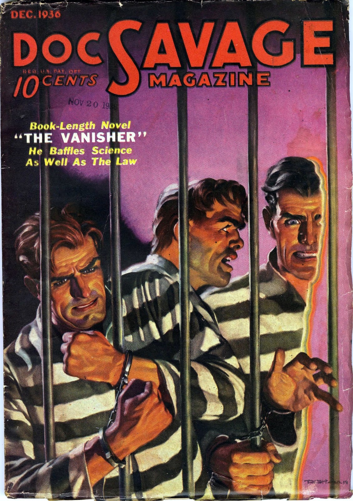 |
| Artist: Robert George Harris |
 |
| Artist: James Bama |
Okay, Classic Doc Pose on the reprint notwithstanding, that hunchbacked fellow of Bama's just looks goofy. I'm going with Harris's cover this time. I love his pulp's colors, with that groovy purple background, and the scene itself is pulse-raising, with Doc, Monk and (I presume but don't know) Ham in the act of unwillingly disappearing into thin air. It's a pretty eye-grabbing and... uh, dime-giving-upping... cover. (I'm sure there's an actual word I was looking for there, but it temporarily escapes me. At least I hope it's temporary.) Anyway, nice cover.
And!
Since this is one of the two original pulps that I actually own, we get to compare blurbs! (So fun!) As usual, the blurb from the reprint's back cover is up top there, and you can see the pulp's front cover blurb above as well, but wouldn't you know the pulp also contains slightly expanded blurbs (or maybe they're more like taglines) in the magazine's Table of Contents: "Law and Science were easy opponents for him to fight against—but Doc Savage proved to be his Waterloo!" and then on the actual story's first page under its title: "He defied both law and science--but bucking the power of Doc Savage was another thing!"
So there. While the pulps may not have had cool paragraph-long back cover blurbs to help them sell, they definitely took the upper hand in spelling out almost-identical-mini-blurbs in multiple places throughout the same magazine.
Double And!
We also get to take a look at the "coming next month" blurbs that the pulps carried at the end of each adventure. These consisted of two versions: one was kind of a standard side bar type thing--boxed off and separate from the story like another ad might be, and the other one was integrated right into the end of the story itself. These blurbs were removed from the reprints, since they weren't published in the same order as the pulps were and so wouldn't have made any sense.
So here's a shot of each blurb, for your viewing pleasure. The stand-alone....

You know what would've been cool was to sort through and put all these original pulp blurbs on the back of each Bantam reprint. Hmm. I suppose they would've been coming across a little dated, even by the 60s, so I can see why they went with something that felt more current. Still, would've been cool. I think so, at least. No, 'cause these blurbs also referenced other stories and things not in the reprints. Could have used the first part and left the magazine-specific stuff out.
Anyway, here's the in-story "blurb." I did a quick compare of both copies--reprint and pulp--and the pulp shown below has the additional copy outlined in red, while the reprint's story ends just prior to the outlined stuff.
Cool, huh?

Well now we must be done, right? Nope, there's more. (NOW how much would you pay?)
Having that sweet smelling old pulp right in my hot little hands (nothing smells as good as an old, old book), I decided to flip through it and take pictures of all the interior images--from the Doc story, at least. So here those are. They come in two flavors, little mini portraits of Doc and other series regulars, and then a series of illustrated scenes from the story itself. (I feel like I've said "itself" a lot in this post. And used a lot of parentheses.)
Anyway. I'm not strictly laying these down in the order they show up in the magazine. There, the portraits are mixed in with the story illustrations. Here, I'm grouping the portraits first and then laying out the story illustrations in the order they showed up in-story.
So here we go with the portraits:


And here are the story illustrations:


Those last two are on facing pages in the magazine, but I couldn't for the life of me tell if they're supposed to be a single illustration of not. I couldn't quite make them match up by sliding them together, and even a quick skim-through of the text didn't show me a scene that matched both images together. Which doesn't mean anything, really. Illustrators often take license when doing their thing. I will say that Doc is noticeably bigger than the people around him in these illustrations. So points for that.
Oh, not sure what happened with those last two images as far as the funky backgrounds. I'd removed story text and made the images transparent, and I thought we'd just see a white background there. Oh well. You get the gist of them anyway.
Which brings me to the time where I say the fellow most likely doing these drawings was Paul Orban (99% sure). The guy was talented and incredibly prolific; a Google Image search will give you plenty to ogle. The 99% is because I remember reading somewhere online that Orban was responsible for this particular issue's art, but I can't find the reference now. I do know he did a huge amount of interior work for Doc Savage Magazine overall, so I'm probably pretty safe.
Okay, now that really is it. We're done for another year. I mean, 1936 is done and we're on to 1937. Not that it will take me a year to get to 1937 (I hope).
Anyway, till then.