Showing posts with label robots and cyborgs. Show all posts

Monday, February 24, 2025

Better a Broken (Poster) Promise Than None at All

Mark Twain said that. 

The thing about promises. Well, minus the (poster) part.

Supposedly he was commenting on the idea that even if a promise gets broken, having at least made it in the first place shows some amount of good intention. I don't know if that's always the case in real life, but it's a nice sentiment. 

Now you might be asking why this particular quote is bumping around in the ol' (deadmans) brain today. And if you are, the answer would be 'cause I've been scrolling through the ol' deadmans Letterboxd watched list, and reflecting on a few films I've seen where Poster Promises either were or were Not Fulfilled (PPF or PPNF). 

And of course I didn't just fall off the turnip truck. In fact, I'm a long time passenger on the advertising-exists-to-sell-things-not-to-tell-the-truth-about-them truck. I've been buying questionable things out of the back of that truck for many a year, truth be told. So I get it: you promise what you need to in order to make the sale. 

Still. Some take this philosophy further than others. I mean, there's breaking a promise and then there's shattering a promise into tiny sharp shards that cut you until blood makes a heart shaped stain on your soul.

That went a little dark.

Really I just thought I'd throw out a few vintage creature features where a poster promised more, creature-wise, than a film actually delivered. Or maybe some did deliver. I guess we'll see. 

As I go I'll say a word or two about each, whatever springs to mind. Unless nothing springs, which sometimes happens. Fair warning.

So here we go. In alphabetical order, cause that's how I'm rolling today.


A*P*E (1976) 


The Promise

not to be confused

Let's see... we got giant shark defied... 

(sorry to insert but every time i read "giant shark defied" my brain changes it to "giant shark defiled" and i don't like the image that brings up for me in my head. no, i do not like it at all. end of insert.)

city destroyed... ocean liner demolished... giant "monster reptile" snake vanquished... apparently all at the same time. Fury of the ten-ton variety. Screen-leaping (and to be fair the film was actually shot in 3D). 

Whew! So much going on here! I'm excited to see this epic story play out...

The Reality

(PPNF)

i am a giant ape
this is not a toy cow

Um... smallish man... ill-fitting ape suit... someone's back lawn... tiny plastic cow. 

Of course, technically the movie did have shark battling-city destroying-ship sinking-snake vanquishing stuff in it, but it was all plastic cow-level shark battling-city destroying-ship sinking-snake vanquishing stuff. Definitely not as promised.

Anyway, I recall my first viewing of this film. That Not Kong Not Jaws Grudge Match was pretty much the first scene of the movie and not only was it was over QUICK, I remember thinking "that little shark the actor is throwing around is dead. They killed a baby shark for this thing." I don't know if that's true but it looked dead.

Hmm... wait. You know, now that I think about it, my very VERY first, pre-poster, eyes-on artwork for this film was more likely the amazing cover Bob Larkin did for Famous Monsters of Filmland #146 below. Check it out:

pretty sure in this version of things the ape was eaten by the shark
swimmer was dessert
 

What an eyeball-feast this cover is! Shark is definitely front and center here. And our poor cover-ape (heroic, unlike his movie-ape twin) is trying so hard to keep his human-lady-love (who never even meets the shark in-film) from being chomped down upon. Doesn't look like he's doing too good a job of things though. Great painting nonetheless. Even if it, too, does not fulfill promises.

Moving on to the next movie... and please be patient as I prep it - no need to get crabby.


Attack of the Crab Monsters (1957)


The Promise

is that crab monster sleepy or bored?
or... is he BOTH?

This poster reminds me of something you'd see on an old pulp magazine cover, you know? The colors and style, I mean. Wonder who painted it? (One quick but semi-thorough search later...) I don't know. Nothing readily available on the web. Gotta be a book out there, or some specialist website or something, right? Well, if anybody knows clue me in.

As far as poster promises go, this one doesn't really go over the moon, does it? Just a big sleepy crab monster, holding swim-clad Pamela Duncan aloft in it's fearsome claw, preparing to tear her asunder. Some Sea Depths. A few Terror Tidal Waves.

I think those are supposed to be crab-monster-antenna or something on its face, right? But that poster makes it look like ol' CM's got jets of water squirting out of his nostrils instead. You agree? I'm not alone here, am I?

The Reality

(PPF)

corn on the crab for dinner tonight

Well honestly this film doesn't do too badly with its fulfillment. Crab is as described, mostly. A little smaller, maybe. Not quite as drowsy looking, which is probably a good thing.

Huh. Is it me or does this actually-in-the-movie crab monster look a little geriatric? "Damn you kids! Get off my beach or I'll gnaw you like an ear of corn at the county fair!"

I don't think Ms. Duncan ever actually gets held aloft by a crab in-film, but then it's been quite a few years since I've given it a proper watch. She does at least appear swim-clad while being menaced by a giant crab, as evidenced by this groovy behind the scenes photo I came across. 

Cool, huh?

if only these two film crew gents can distract the beast for a few more seconds
i can make it over to that out-of-shot motorbike and escape

Now, let's move along to the kitchen... ah, mall... kitchen store... to get us some knives to chop our - oh fuckit never mind. Chopping Mall is the next movie.


Chopping Mall (1986)


The Promise

i spy with my little eye

Not gonna lie. First time I saw this artwork I thought it was a zombie arm holding that shopping bag. I think it's the way those little indentations and stuff on the hand were done - they looked more like pus pockets or bite marks than they did, I dunno, robot rivets or whatever. And those wires coming out the elbow looked like veins or torn flesh. To me. And that first time, since I'm not a big zombie fan, I was probably a bit dismissive. 

But once I figured out it was supposed to be a robot arm, man I was all in. Specifically, it was an android robot arm. I mean, this poster clearly and unequivocally promises one or more killer androids rampaging through a shopping mall, does it not? 

I was SO EXCITED because I love killer android movies, and this was totally gonna be one of those. Killer androids are creepy, with their whole uncanny valley thing going on. You think it's a human being but something is just a little off and you don't know quite what until that first wound gets inflicted and OH MY GOD THERE ARE GEARS AND WIRES IN THAT PERSON'S ARM! Love the reveal. 

So much cooler than those lame little roly-poly-tank-tread robots like the one they had in Deadly Friend (1986)...

The Reality

(PPNF)

excuse me (deadly) friend, may i borrow your lawn mower

no. get your own fucking lawn mower, mall cop
Oh. Well then.

Now don't get me wrong, I love this movie. Own it on Blu-ray and pull it out for regular re-watches. But the first time I ever saw it, with that killer android poster art fueling my expectations... man was I pissed. 

And it's not like you gotta have a shit ton of money to make a decent lo-budge android - look no further than 1990's Crash and Burn for proof of that:

bill moseley in the lo-budge android makeup chair
lo-budge and holdin' a grudge

So yeah. Chopping Mall is not delivering on the very most important of it's promised promises. Bastards.

Still. A blast to watch. (And so is Deadly Friend.)

Okay. On to some intergalactic (or at least interplanetary) devilry.


Devil Girl From Mars (1954)


The Promise

i and my voluptuous curves menace you and so does my giant robot
who also has voluptuous curves

Definitely some promises being made here: We got menace. We got terror. We got a statuesque-lady-in-form-fitting-bodysuit, staring out impassively as she decides the FATE OF THE WORLD. We got male-fear-recoiling and female-leg-clutching. 

And we've got a damn cool looking robot henchman standing guard to the right, there. Run! Flee from the exceedingly cool giant robot!

The Reality

(PPNF)

and over here we have the latest model of our martian portable stereo console
and it costs less than you think!

Okay. Elephant in the room: Little misrepresentation on the robot front I think. I mean, we just finished talking about Chopping Mall, so I can't be too hard on this guy, right? He's at least got legs and feet, doesn't he?

But c'mon, scroll back up to that poster for a minute will you? Yes, poster-bot has legs as well. But that's honestly about the only similarity you'll find. Poster-bot also has gleaming metallic skin and swelling metal pecs and abs. Cool swishes and swips in his design. Poster-bot has hips for godssake!

Movie-bot has no hips. Movie-bot looks like that gigantic home stereo console, with phonograph, tuner and eight track all embedded in its depths, that I used to marvel at as a kid whenever we visited my grandma's house.

And the bot is not our only glaring misrepresentation, either. Let's take a gander at statuesque-lady-in-form-fitting-bodysuit, shall we?

couldn't find her ruler so gonna rap some knuckles with this kitchen mixer

Let me introduce you to stern-schoolmarm-from-mars. During summer break she moonlights selling intergalactic vintage home stereo consoles. With phonographs. And eight tracks. 

No fault of actress Patricia Laffan though - she wasn't a stern schoolmarm in real life. She was a lovely English stage, film, television and radio actress and also a fashion impresario, as we can see by this escalator portrait taken while not wearing her martian devil girl costume.

lovely woman

I had to look that up - fashion impresario. One of those terms I recognize but don't have more than a vague definition for. It means someone who is a creative force in the fashion industry who combines art and business to shape the fashion landscape. Good for her.

Oh. And while we're at it, this movie little to no fear-recoiling, and no leg-clutching either. This is one of the more stilted, low energy, talk-don't-show films I've seen. Characters stand about almost boredly discussing the FATE OF THE WORLD - discussers wanted, no leg-clutchers or fear-recoilers need apply.

Okay. Let's move a bit closer to home for the next film; maybe even head down onto the ol' bayou. (Insert chorus from "Down on the Bayou" into your head... NOW. Good song. Great band.)


Frogs (1972)


The Promise

ribwrist... ribwrist...

EVERY time I see this poster art I think of a giant frog who for whatever reason decided to have his frog tongue surgically swapped out with a human forearm. That's weird, right? 

Why would he do that?

Anyway, poster promises: for sure we're being promised a giant frog or two - that guy on the poster is the size of a small to medium-sized dog. Looks apparent that we'll have some humans-as-frog's-breakfast, too. Nature will be striking back, with large (tidal waves are large) amounts of slithering, devouring and destroying.

The Reality

(PPNF)

oh the horror!
i am not putting that cake anywhere near my mouth

So yeah. In spite of being a reasonably fun watch, this film includes no giant frogs. Or giant anything else's. Also no people-eating. Some people-killing, to be sure, but no eating. 

On the plus side, it's got a lot more than angry frogs going for it. Has a whole swamp-full of angry vengeance seeking critters - snakes, spiders, lizards and more. 

Although to be honest the animal wranglers had a pretty tough time getting any of those critters to look awake and interested, let alone angry and vengeance-seeking. Hard to blame the handlers. Reptiles and insects have a notoriously limited range when it comes to acting.

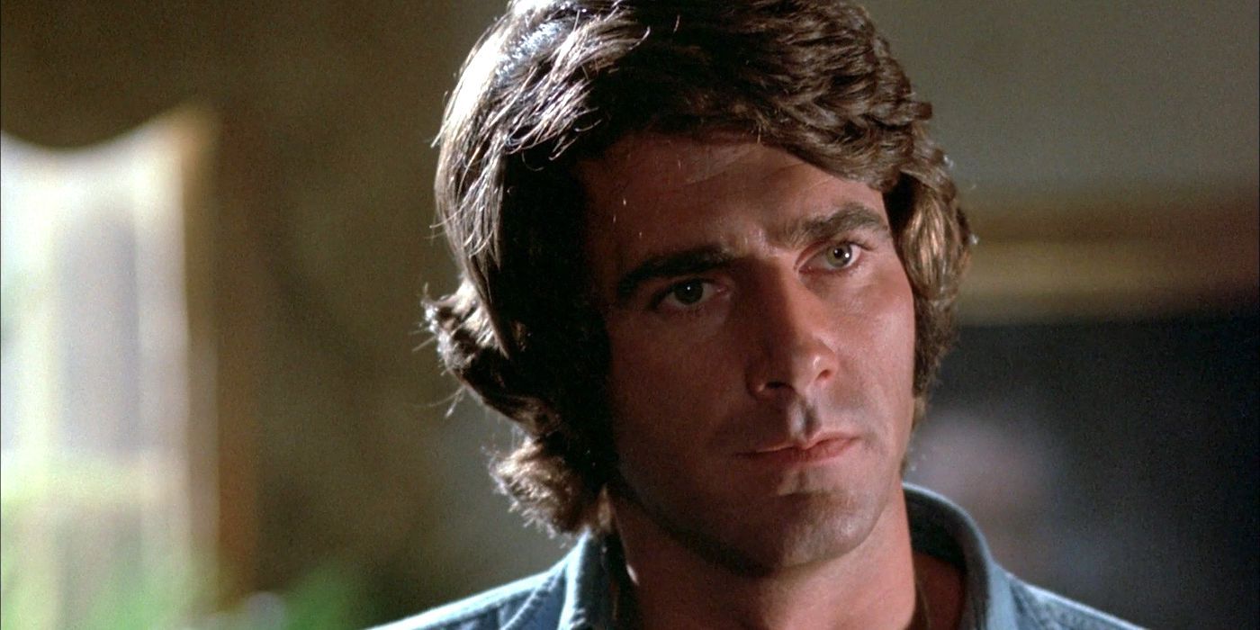
Also, this movie has a baby-faced-sans-mustache Sam Elliott in it, which is it's own fun.
master of the lip bonsai
And WHAT Sam Elliott has been married to Katharine Ross since 1984?! I had no idea...


Great White (1981) 


The Promise

look let's not haggle that's an amazing poster amirite

Let's be honest it would be tough for nearly any film to do this poster proud, especially back in 1981 - this is a GREAT poster. 

And this poster's promise is all about the fish. A Megalodon-sized fish. A crafty, stealthy son-of-a-fitch fish. A fish who gleefully, even wickedly grins as he prepares to snarf down his unsuspecting morsel, which morsel only wanted a nice tan and is that reason enough to be kilt off by a Wicked Megalodon Fitch? It is not. 

We mourn this morsel as we know corpses do not keep their tans long at all.

The Reality

(PPNF)

rubber duckie you're the one
you make bath time lots of fun
rubber duckie i'm awfully fond of you

A big, plastic, bobbing fish head, with two guys under the water, holding it upright so it doesn't just upend and float away. Okay, I have no idea if there are two guys underneath holding it in place, or even what it's made of, but that shark prop is shit. 

Movie's a fun watch, though, as long as you go into with the right attitude. (Hint: "I can't wait to see these amazing shark effects!" is not the right attitude.)

Onward to an invasion... of sorts.


Invasion of the Saucer-Men (1957)


The Promise

i don't know what to say except that i still long to see the movie this poster promises

This one is also a great poster. Maybe not as iconic a feeling as the one Great White has going for it, but still. And this poster just lays it all out for you, right? You will...

SEE teenagers vs. the (gigantic!) Saucer-men! 

SEE disembodied hand that crawls! 

SEE night the world nearly ended! 

SEE earth (or at the very least one of its larger cities) attacked by (three if not more) flying saucers!

The Reality

(PPNF)

come to hollywood they said
it'll be a thrill a minute they said

Okay, first things first: hard to imagine any of these fellows holding a full grown woman aloft in one hand. A little hard to imagine even if all three worked together using both hands.

And I know, it's a bit of a cheek to compare a behind the scenes photo to the excitement of that poster. But honestly, this photo is pretty indicative of the film as a whole.

As for world-ending, large cities and multiple saucers, it's been awhile but what I remember is a small backwoods town and just one saucer that I think the army blows up without meaning to. 

The crawling hand is totally delivered on, though.

But like some of the others, this is also a fun little film and, in spite of it's PPNF status, filled with charm and purposefully silly dialogue. Based on a short story that ends a bit more darkly than this movie does, as well. Just sayin'.

So, on to the next movie, lest we lose track of time and forget...


The Land That Time Forgot (1974)


The Promise

wait is that 2013's Poseidon Rex down in that corner, way back in 1974?

Well, I just love this film so you're not gonna see a lot of hate from me here. And I will say that pretty much everything we see on that poster, we also see in the film. Except the aquatic T-Rex/Allosaur.

The Reality

(PPF)

hahahahahahahahahahahahahahahahaha

Well. Loving the movie as well as feeling like it lives up to its poster promise clearly does not stop me from including this hilarious animated GIF. Way too good to pass up.

The GIF, in fact, makes the movie's effects out to be much worse than they are in reel life. The film's dinos were actually quite nicely realized (mostly as rod puppets) by a very talented fellow name of Roger Dicken.

And lest you wonder, by "very talented" I mean to say he also worked on movies like The Blood Beast Terror (1968), 2001: A Space Odyssey (1968), Witchfinder General (1968), When Dinosaurs Ruled the Earth (1970), Scars of Dracula (1970), Alien (1979), Warlords of the Deep (1978), Q: The Winged Serpent (1982), White Dog (1982), and The Hunger (1983). 

Nuff said. On to the very last film: The... stinger... if you will.


The Wasp Woman (1959) 


The Promise

creepy

Well this is a pretty bizarre poster, I gotta say. Kind of a cinch it's not going to deliver due to that bizarreness on it's own. Seems like it's giving more of a "this is what the film will feel like" kind of vibe rather than straight up promising a giant wasp-woman.

But I would surely have paid a few bucks back in the day to see a giant-ass wasp with a woman's head and face, clutching some poor devil as she reels him in to his demise. (Quint would've said "...reels him in to his demeeeeeeeese." If his character were in this film, I mean.) 

Anyway, as far as promises go we have the giant wasp. We have "a beautiful woman." A "lusting queen wasp." Then we've got a wee struggling man and a pile of bones. 

Promises fulfilled?

The Reality

(PPNF)

i kill men after cleaning their pipes with my pipe cleaner antenna

No. While Susan Cabot gives a fine performance (finer than the film itself, I think) this one is shakes out as PPNF on the lack of giant wasp-ness alone.

I mean, as far as the "beautiful woman" promise goes, Cabot delivers. She was both beautiful and quite talented. The "lusting queen wasp" promise - I don't remember lust playing into the film at all, to be honest. Well, not sexual lust. Probably they were going for blood-lusting queen wasp, though. Which we do get. 

And the wee struggling man atop pile of bones... I'm gonna say no again. It's been (quite) a few years since I've watched this one all the way through, but I'm not remembering an any-sized pile of human remains in the film, let alone a big ol' pile like the poster promises. 

And, of course, since there was no giant wasp in the movie we could have no wee man struggling in its clutches.


And that's it, my friends. Our work here is done and the tally is:

PPF - 2

PPNF - 7


Until next time...

Sunday, March 4, 2018

"If you have a garden and a library...

...you have everything you need."

Apparently Cicero said that. I don't know a damn thing about Cicero, but if you follow that link you'll find out all sorts of things about the guy. I just liked his library quote, and I needed a library quote on account of I recently went to the library and wanted to tell you all about the books I got. That's right, this is a mini multi manuscript post, for your reading pleasure. (And for mine as well, having just been to the library.)

Oh, that reminds me--you can read about another library adventure I had by following this link. But be warned, "here there be sex and violence." (Hah! Now you can't help but take a look....)

Anyway, this latest adventure happened to be my very first time in a new library, since making a move from the Southwest Mountains to the Pacific Northwest. Mmm, I suppose "adventure" is a bit of a strong word for this particular occasion. Not that the library sucked or anything like that, it was just a fairly sedate experience. The library itself is amazing, and I'm sure it and me will be best friends very soon. (We've already become cozy acquaintances, just from this one visit.)

Okay, enough with the Library Love Notes; on to the loot:


Grrrr! No one will ever guess from my cover that I was written by John Landis. Grrrr!
I saw this one, kind of tucked down on the bottom shelf outside its assigned spot, and actually pushed an old lady down and then kicked a kid in the shins so I could get to it first. Okay, that's not true; the aisle was empty and I'm not a violent man by nature, but if there had been some kid reaching for it, I'd have pled and (possibly) bribed with whatever cash happened to be in my wallet in an attempt to get it from him.

I've had my eye on this book for awhile, but it was one of those where I couldn't see shelling out the original cover price ($40) without getting it in my hands and previewing it first. Well, now that my sweaty little hands have dampened its pages, I'm all about owning a copy, forty bucks or not, and it has happily turned out to be a "not" on the forty bucks front, as Amazon tells me a new paperback version is available for just 17 measly dollars (yay!). And you better believe it's on its way from an Amazon warehouse near me.

This is not some highfalutin big-words book about film theory; this is a book by a guy who loves movie monsters, has access to tons of amazing high quality photos of those monsters, and decided to make a book out of 'em. And it's beautiful. Plenty of behind-the-scenes and in-the-business notes and anecdotes by Landis, which is extremely enjoyable itself, but those photos.... Incredible.

The real litmus test? Number of movies (some seen, many not) pulled for future viewing and/or blogging: 143. (Sorry Dan, clearly I misheard you. How many movies did you say you pulled from A SINGLE AND SOLITARY BOOK that you now want to follow up on?) Oh, you heard me right: One. Hundred. And. Forty. Three.

Nuff said.


I have a very long gun positioned right in front of my crotch and there is
NOTHING SEXUAL ABOUT IT.
Had to pick this one up, too, on account of I've been hankerin' to watch some blaxploitation films but haven't really had much of an idea on which titles to choose (most of my experience has centered on blaxploitation horror, but I'm looking to branch out, dontcha know).

Anyway, turns out this really IS "the essential reference guide." It's chock full of movies (over 270 of 'em), mostly made between 1970 and 1980, and it's got synopses, interviews with directors, old and new reviews of various films, and assorted other groovy things to hold your interest. The book was published in the UK and I thought at first it was going to be a British take on the genre (which would have been interesting in its own right), but turns out the guy who wrote it was born and raised in NYC/New Jersey.

Check out some of these titles and taglines:
Is the Father Black Enough? (1972) "A Racist wind blows the dust from a Black man's grave to choke the honkies to death!"
The Thing With Two Heads (1972) "They transplanted a WHITE BIGOT'S HEAD onto a SOUL BROTHER'S BODY!"
Hit Man (1972) "He aims to please!" (Yeah, that would be the movie referenced on the book's cover. Absolutely no sexual innuendos were harmed in the making of this film.)
Willie Dynamite (1974) "Ain't no one crosses WILLIE "D" He's tight, together, and mean. Chicks, Chumps, he uses 'em all. He's got to be Number-One."
Number of movies pulled for future viewing? 36. (Not bad. Not bad at all.)


I am not particularly representative of what lies between my covers,
but you checked me out anyway, so there!
Hmm... those flying saucers in the background are definitely lifted from Devil Girl from Mars. Makes me wonder what other film references might be lurking on that cover?

At any rate, this book's an odd duck at best. I grabbed it on the title alone, but turns out it's one of those "not necessarily representative of actual content" titles. To be sure, there are plenty of robots inside, but I'd guess more than half the films covered are either marginally or not robot-related in any way.

The author makes an attempt to bring certain films or groups of films inline with the book's stated theme, like considering Frankenstein's Creature a "mechanical man" and including a bunch of Frankenstein-esque films. (Okay, I get his drift, but sewn-together reanimated corpses do not a metal automaton make.) Then the guy goes way off course, devoting chapters to decidedly non-robotic things, including one on movies featuring people who are "reminiscent" of robots due to being dressed in space or diving suits. (What?!)

Think I'm overstating things? Check out these woefully misguided excerpts I grabbed from random spots in the book:

"The lurching metallic creatures of The Amazing Colossal Man and its sequel The Terror Strikes [War of the Colossal Beast] were sixty feet tall as well as impervious to attack." (Right. These "creatures" were actually a single character, and there wasn't a thing "metallic" about him. He was a regular-flesh-and-blood-joe, grown to gigantic proportions after being exposed to--you guessed it--atomic radiation. Not a robot to be seen anywhere in the film.)

"Flash Gordon... was given the full high-voltage laboratory treatment as if he were to be shocked into becoming an electronic robot." (Alongside a photo of Flash being electrocuted by the bad guys. Notice those words "as if." I don't know, cuz being electrocuted, it's "as if" you were being turned into a robot...? Besides, a person being turned into a "robot" would really be a cyborg....)

"In Soylent Green, the Malthusian nightmare of an overpopulated world of city mobs, controlled by a few men using machines to scoop up any dissidents like a spoon scoops up grits, is the final solution." (Humans behind the wheels of garbage trucks sporting big mechanical scoops on their fronts--absolutely indistinguishable from... robots!)

"...in the James Bond fantasy Goldfinger.... the hero is threatened with emasculation by a giant laser beam, the ultimate threat and triumph of mechanical rape against male pride." (Yeah, the book spends a fair amount of time exploring "serious" themes like this. I can just hear the editorial discussion: "A Bond movie? Sure! Is there a machine of any kind in any scene at all? A laser, you say? Great! Write something 'smart' and add it in!")

Okay, enough. Disappointing book. Still, I did manage to pull 21 movies for future viewing (of which less than half contain any kind of robot at all....) from the thing, so there's that....

And y'know, standing in the library, this author seemed familiar to me. Sure enough, getting home I discovered on my very own shelf another book from this same series (the book's called Catastrophe) similar to the robot book's lack of robots, it's filled with not-actually-disaster-films. So there you go. Both books are part of a British series from the 1970s, which you can read all about by following this link. (Incidentally, that link also takes you to a balls-out-fantastic genre film blog, which unfortunately seems to be lying fallow at the moment. Definitely worth a look around at past content though. Seriously, amazing!)


And that's it. Dan's latest library visit has now been chronicled. (My work here is done.)

Friday, February 2, 2018

Target Earth (1954) & Deadly City (1953) by Paul W. Fairman

(&)

Let's see. What do I want to say about this little film? (It is quite small, in terms of both budget--$85,000--and run-time--75 minutes.) Hmm. I think what I'll say is that it kind of surprised me by not being what I thought it would be.

What I thought it would be was a fairly forgettable 50s low-budget invasion sci-fi-er, with acting and effects so horribly unconvincing they would be hard to sit through. And while it definitely was low-budget sci-fi (complete with unconvincing effects), it wasn't in the least forgettable.

The movie in fact turned out to be a reasonably well-acted and fairly satisfying little psychological drama. There weren't really all that many sci-fi elements--they were more worked in around the edges--and the human drama going on at the film's core could have taken place in any number of settings and done just as well for itself.

So the plot is basically this: Nora King wakes up (in what I think stays an unnamed city throughout the film) with an empty bottle of sleeping pills on her nightstand, having just inadvertently survived her suicide attempt. (We learn later Nora was the one driving when she and her husband were in a fatal-to-husband car accident, and she's been blaming herself for hubby's death.) Well, she notices pretty quick her water and electricity are both off, and after knocking on a few neighbors' doors, decides to go outside and see what's up.

Off-screen at about the same time, Frank Brooks, a businessman passing thorough the city on his way back to Detroit, is coming to after having been slugged over the head, robbed and dumped in a back alley. Now the point is this: both these folks have been unconscious for a good portion of the previous day and night, and as a result have no idea what's going on when each separately wanders out to find... the city is completely deserted. The two eventually meet up and, after a rocky start, are off together in search of food, shelter, and/or a way out of town. Oh, and they're looking for other survivors, too.

Which they find (other survivors, that is) in the persons of Jim Wilson and Vikki Harris, a hard drinking, ten-years-together-but-never-married couple. It seems Jim won a little money at the track, and the two went out and got so drunk on his winnings, they ended up sleeping through whatever had emptied the city out as well, so they're no help in solving the Empty City Mystery. The group is eventually joined by a gun-toting fifth character, "Davis," and before too long we find out the man is not only unbalanced, but wanted for... muuuuurder.

So this mystery is playing out in the first part of the film while its characters are figuring out what's going on, and the actors do a really nice job portraying the fear, bewilderment, volatility, etc. you'd for sure be experiencing in a situation like this. It's just a nice bit of work.

And, while the group does eventually figure out the city has been evacuated in the wake of an--eeeeeeeeeeek!--alien invasion, and that there are myriad (though we budget-consciously only see one at a time) death-ray-sporting-remote-controlled robots wandering about killing survivors on sight, both the invasion and its robots are mostly sidelined as we follow this little group of extremely disparate individuals around in an extremely high stress situation and watch how they treat each other.

And it's pretty interesting to watch. Of course, the movie ends with the army roaring in to save the day as Nora and Frank are about to be death-rayed, and along the way there are a few bits of lumbering-robot-ness, interspersed with scenes of military scientists figuring out a way to stop said robots, but honestly these scenes feel tacked on and most of the time we're just following the group of survivors as they try to avoid being killed by each other and/or the invaders. Like I say, it's a fairly taut little psychological drama, worth a watch.

So then. I'd noticed in the film's opening credits it was "based upon the story 'Deadly City' by Paul W. Fairman," and I'd enjoyed the film enough I thought I might try to find myself a copy of the story. Which I did.

Turns out it was published the year prior in March 1953's issue of If: Worlds of Science Fiction. (Fairman had used a pseudonym, "Ivar Jorgenson," for the magazine.) And what do you know--the source story turned out to be just as, if not more, enjoyable than the derived film had been.

You can give this story, and a few others as well, a read for yourself (it's billed as a "short novel" but only clocks in at 34 pages) by following the link above to the Internet Archive, where that particular issue of If resides, all public-domain-legal and everything (I love it when that happens).

And I'll tell you this: The story is both more and less than the film it spawned. (Hey! What does he mean by that? He's being so mysterious!)

What I mean is this: the story focuses even less on the alien invasion than the film does--there are no robots at all, and the invaders are only seen by our group once and from a distance. There's also a lot less army goings on in the print story--the military just rolls up at the very end to "explain things" after the invaders have all died from some Earthly atmospheric contaminant (a la War of the Worlds). So in print this story is ninety nine percent human drama, versus the film's maybe 80/20 split between drama and sci-fi.
As far as it being more than the film, the story's characters definitely feel more gritty and "real" than the film's do, and the story's action unfolds a lot more brutally than the movie's does. I'm sure that's mostly due to censorship issues the film would have been forced to dance around, but I'm telling you, the story doesn't dance around much of anything, and the ugliness we sometimes see in human nature is well on display. In fact, the story makes a point of exploring that ugliness in a fair amount of depth, which is where much of the fun comes in. There's a fair amount of violence, a bit of nudity, and even some (out-of-scene) sex depicted in the story--a little surprising for a mid-fifties mainstream offering.

As far as main characters go, the film's Nora King is Nora Spade in Fairman's original story, and rather than being a guilt-ridden widow, she's a prostitute who can't face another day of turning tricks. Frank Brooks is pretty consistent between story and film, other than leaning more towards blue-collar than businessman in  the print version.

The print story's Jim Wilson is a violent, recently jailed thug who'd used the evacuation as an opportunity to escape lock-up. His companion Minna Trumble (the film's Vikki Harris), rather than being Jim's long term companion, is recently acquired and almost a captive--trading sex for protection and a sense of belonging.

The film's gun-toting Davis is, in print, Leroy Davis--a considerably more terrifying (than the movie's) psychopath, with a history of killing that his family has used their wealth to cover up. During the evacuation, he kills his chauffeur and sets out on a glee-filled murder spree, like a (ghoulish) kid in a candy store.

Okay, so if you're a regular, you already know deadmansbrain is a captivating-but-spoiler-ridden-land-of-enchantment, and right now I'm about to throw one of those (a spoiler) into the mix, because I really wanted to give you a sense of the story and Fairman's prose. The spoiler is this: Davis dies a gruesome death in both movie and story. There. With that being said, here's an excerpt of the very scene....
He fired the gun twice and Minna died appreciating the incongruity of his words. She went out on a note of laughter and as she fell, Jim Wilson, with an echoing animal roar, lunged at Leroy Davis. His great hand closed completely over that of Davis, hiding the gun. There was a muffled explosion and the bullet cut unnoticed through Wilson's palm. Wilson jerked the gun from Davis' weak grasp and hurled it away. Then he killed Davis.

He did it slowly, a surprising thing for Wilson. He lifted Davis by his neck and held him with his feet off the floor. He squeezed Davis' neck, seeming to do it with great leisure as Davis made horrible noises and kicked his legs.

Nora turned her eyes away, buried them in Frank Brooks' shoulder, but she could not keep the sounds from reaching her ears. Frank held her close. "Take it easy," he said. "Take it easy." And he was probably not conscious of saying it.

"Tell him to hurry," Nora whispered. "Tell him to get it over with. It's like killing—killing an animal."

"That's what he is—an animal."

Frank Brooks stared in fascination at Leroy Davis' distorted, darkening face. It was beyond semblance of anything human now. The eyes bulged and the tongue came from his mouth as though frantically seeking relief.

The animal sounds quieted and died away. Nora heard the sound of the body falling to the floor—a limp, soft sound of finality. She turned and saw Jim Wilson with his hands still extended and cupped. The terrible hands from which the stench of a terrible life was drifting away into empty air.
Yikes! Pretty intense. Oh. Belated double spoiler: Minna dies too.

Fairman also ends the story in a way that's fairly discomfiting to me (yet more spoiling ahead): He makes a point of bringing Nora and Frank together in the midst of this crisis, with Frank appearing to come to terms with Nora's past as he falls in love with her. But at story's end he sheepishly walks away, telling himself one just doesn't settle down with "a prostitute," and the very last scene has Nora back on her own, turning tricks again. Fellow-survivor Jim is back in the slammer and it almost seems like Fairman is saying "See, humanity may rise to an occasion when it's forced to, but people are basically schmucks and lasting change for the better is really just a pipe dream." Now that's chilling.

And on that depressing note (Geeze, Dan, lighten up!), I guess I've said all I set out to say about these two little items. So yeah, while neither film or the originating story are top tier stuff, both are engaging and more than worth a few minutes of your time, especially if you want to explore the whole print to film translation (which I love doing).

Let's see, brains? I'm gonna have to give the film and story each their own count, on account of their being as different from one another as there are. So here goes:

Target Earth: TWO AND A HALF LOW-BUDGET-ROBOT BRAINS

"Deadly City": THREE HIGH-BROW PULP FICTION-Y BRAINS

Oh, and guess what? Fairman also wrote another story that was later turned into a movie. I haven't read that one yet, but the movie derived from it was (long ago) covered right here at deadmansbrain. It's pretty choice in its own right....

Thursday, January 12, 2017

Martin Caidin's Cyborg Series Covered

Welp, here we are with yet another not-movie-themed post, and here I am thinking again how I really ought to just go ahead and change the subtitle on the banner up top to be more inclusive. I mean, this site has become at least as book-centric as it is film-centric.

But. I really do love the feel of that banner, as is. It makes me all nostalgic about deadman's (almost decade old! when did that happen?) origins.

So I guess I'll leave it. For now.

So. I thought at first this post would just be an interlude-within-but-still-part-of the Bionics in Miniature series which I'm still (slowly) doing, and I also thought it would include all the SMDM/BW novel-y stuff I could put my hands on. But that's turned out to be a lot of stuff, what with international editions and all. So then I figured I'd just stick to Martin Caidin's original Cyborg quadrilogy (that's him up top with the cigar, in case you wuz wundrin'), which has managed to cough up a good 25 covers (and I'm sure I've missed a few) all by itself, and that's plenty for one post.

Anyway, after thinking that, I thought to myself "books aren't action figures and action figures aren't books," so I went ahead and gave the action figure series its own label, and this post a more generic "bionics" label, that will have more generically bionic stuff in it (as time goes on).

And that's how I came up with that idea.

I also couldn't decide how to sort the covers I'd come up with here (lots of indecision today). Should I go with the old tried and true by-date-published, or go by-publisher-set for cover continuity's sake? Well, I ended up doing a mix of both, because some of these sets have books that really complement each other and it's nice to see them together. But there are a few incomplete sets and loners tossed in as well. The order I finally settled on probably only makes sense to me but, as Scooby Doo always said, "Roh Rell."

I think I'm pretty solid as far as each book's publishing information goes. I coordinated everything between Fantastic Fiction, Good Reads, ISFDB and WorldCat. A few of the books I had to search out in other places, as these sites didn't have the info. They're my usual go-to's though, and are generally pretty reliable. Still, consider the usual disclaimer in place: I only know what the internet tells me (unless I own copies of a particular book, which I do for some of these).

And now (thank god, you're thinking) we have arrived at the point of talking about these actual book covers, themselves. No particular expertise on my part here, this is just me talking about things that interest me.


So this first set comprises, according to my various sources (as well as my childhood library recollections), the first editions published. Cyborg came out in 1972, with the sequels coming out each consecutive year after that. But let's face it, not a lot going on with these covers. I mean, they're cool--cyborg silvery grey, 70s futuristic font and all that stuff, but nothing saying "pick me up and buy me" (unless you were even then, hungry for all things robotic, like I was). I mostly like these covers for the nostalgia they bring me: they're the editions my local library had in stock as a kid, and I checked all four of 'em out more than once, over the years.

And since there's not a ton to say about these particular covers, I'm gonna go ahead and toss in each book's basic plot line, by way of back cover blurbs, below. I say "back cover" rather than "dust jacket," since I'm taking these blurbs from books I actually own, and they all happen to be later paperback editions. But you'll still be getting the general idea.

Here, take a look:

Cyborg 1972 Hardcover - Arbor House
BIONIC RESURRECTION. Austin was dead, at least he should have been. What was left of him after the crash wasn't enough to make living worthwhile. But the government's Office of Special Operations thought differently. They were willing to pay any price to make Colonel Steve Austin into the kind of man they wanted. And what OSO wanted, OSO got... a wholly new kind of man, a man born of a marriage of bionics and cybernetics. Here would be a human being with electronically engineered parts that functioned perfectly. Powerfully. Incredibly. A cyborg! But once they had Steve Austin together again, they told him what they had really wanted, what they had wanted all along. A weapon...
~ (from Cyborg 1978 Paperback - Del Ray/Ballantine)

Operation Nuke 1973 Hardcover - Arbor House
STEVE AUSTIN, CYBORG, IS THE WORLD'S DEADLIEST WEAPON. When Steve Austin, astronaut, crashed from the skies, he woke to find himself a fragment of a man--no legs, one arm, one eye. But Science rebuilt his body, giving him physical powers no other man possessed. Now, the world is threatened by a syndicate that sells nuclear destruction to the highest bidder. And Steve Austin who, from the moon, saw the Earth as fragile and precious, is the one man who can save that world from the ultimate blackmail of our times.
~ (from Operation Nuke 1974 Paperback - Warner)

High Crystal 1974 Hardcover - Arbor House
IS THIS A SECRET LINK TO THE CHARIOTS OF THE GODS? High in the Andes is an impossible highway, more than two miles above sea level, built on rocks smooth as marble. Who built it? How were such huge slabs of rock lifted to such heights? What forces were used to fuse them into an unsegmented strip? No modern man has explored these mountains; what ancient culture flourished here and performed such marvels? Only Steve Austin can lead an expedition into this hostile land. Only the bionics man can hack his way through the fields of razor-sharp grass, scale the sheer rock cliffs and fly the turbulent skies from mountain ledge to mountain top where the source of the secret energy is hidden.
~ (from High Crystal 1975 Paperback - Warner)

Cyborg IV 1975 Hardcover - Arbor House
MAN-SHIP! Never before has there been a bionics man like Steve Austin--his human capabilities enhanced by the superb electronic reconstruction of his body. Never before could there be such an aeronautic experiment plugging the perceptions of a man into the controls of a spaceship. When the ship rolls, it is Steve Austin rolling in space. When cosmic rays hit the plane's shell, Steve feels them as though they were pelting his own skin. Dangerous! Terrifying! But Steve must accept the challenge to outmaneuver an enemy in the race for space supremacy.
~ (from Cyborg IV 1976 Paperback - Warner)

Now as far as these silver first editions go, I know the first two books were published before the SMDM movies and series were a thing, so I'm guessing the first novel's cover above (the only image of it I could find online) is actually a reprint published after the show was out. How else would we be seeing "A 'Six Million Dollar Man' Super Agent Adventure" on its jacket? Oh. Now that I look, it also advertises the next two books in the series, so I guess it's pretty obviously a later printing.

Extremely small mystery immediately solved by looking closer.


Okay. Here's a shot of the first edition paperback, from Warner Books, which corresponded with Arbor House's hardcover. It was also published in 1972, so it was pre-lee Majors, with no likeness of him and no mention of the TV show anywhere on it. As far as the cover's artwork goes, IFSDB tells me "the artist is not credited, [and there's ] no visible signature on the artwork." So I guess that's as far as I'm getting, artist-wise.

In its general look and tone though, it's pretty standard early 70's American, don't you think? What I mean is it's a book I'd pick up and just assume was probably published after 1969 but before 1975, even if I didn't immediately notice its title and author. It's got the feel, you know?

Anyway, it mentions The Andromeda Strain at its top, and while I don't remember that novel being particularly "explosive," it was a good read. Come to think of it, this cover's style reminds me of The Andromeda Strain's first edition artwork by Paul Bacon. Not saying he did it, just that the general feel of the covers are the same to me. Huh. Which kind of blows my theory since The Andromeda Strain came out in 1969, making it not an early 70s cover. But just barely. Still a good theory, I think.

And what does that chest full of circuitry remind you of, fellow Kenner fans? (Yep. Me too.)

Cyborg 1972 Paperback - Warner

At any rate, any cover image involving a chest full of circuitry would have had me on my way to the register, cash in hand, whether I knew what a cyborg was or not (and I did), so that cover would have been doing just what it was designed to do.


So. Now let's take a look at the British first edition hardcovers for the series. Definitely more exciting than their American counterparts, these were put out by W. H. Allen, generally about a year after each book was published in the States. I didn't find artist information on any of these except the last one, and its cover is different enough from the first three I wouldn't want to hazard the guess they were all done by the same guy. You never know, though.

I really like this first cover. That's a great portrait, for one thing, and the carved-from-stone look it has going for it works in a novel that's about a guy questioning his humanity after being cybernetically enhanced (in the form of man but not actually flesh, and so on). Add in the lower montage of story scenes and characters, and that colorful backdrop offsetting the foreground's sedate palette and wallah! An all around nicely done cover.

One thing, barring the title you'd never know this was anything to do with robotics or cybernetics, or even anything science fiction-ish at all. Still a great cover, and enjoyable to look at regardless of what it indicates (or doesn't indicate) about the story itself.

Cyborg 1973 Hardcover - W. H. Allen

Hmm. Looks like they went with a much simplified version of the first book's cover design for this second one. Meh. Anything I'm responding to here is really a response to the first cover being echoed. I don't like the simplified line work of the portrait, and replacing a beautifully done montage with a duo-tone cutout of a mushroom cloud is just plain lazy.

I wonder if the redone portrait was intended to make Austin look more physically powerful than he did on the first cover. He does look more imposing, here--wider-jawed, thicker-necked. More Adonis-like. But I actually prefer the last book's more vulnerable looking Statue-Steve.

Still, I'd have certainly recognized this cover as being related to the first one, and would've picked it up, assuming that first book had made me a fan of the character. Maybe callback of emotion was all they were going for here, and if so it works for that.

Operation Nuke 1974 Hardcover - W. H. Allen

Aha! Next we have the first cover (as ordered in this post, anyway) that shows off Lee Majors' likeness as part of its design. And it does that well. It's an easily recognizable TV-Steve, they've got here. While technically Lee Majors started with the role in 1973 with three TV movies, and the series proper started in 1974, it wasn't until 1975 when this was published that people were strongly identifying him with the character, so it makes sense to me this would be the first book (in W. H. Allen's series) to explicitly use his image.

It's a decent enough cover in and of itself, but I think it would have been seeing Majors on it that got me reaching for my wallet. Nice design with the crystal-multiple-image thing going on. And it's somewhat reminiscent of the first two covers, I guess. It carries the same title/author colors and fonts as the last one, anyway. Hmm. That parachute disappearing off to the left has me wondering if it's a wraparound cover, with maybe a montage or something else on the back. I couldn't find any other images to tell me for sure.

High Crystal 1975 Hardcover - W. H. Allen

Okay. While the cover of High Crystal was at least vaguely reminiscent of the first two novels in the set, the publisher went in a completely different direction for Cyborg IV, cover art-wise. Admittedly, this fourth novel was a different animal than its predecessors--less action packed and more cerebral--but it sure would have been nice to go with something here that tied it into the earlier books visually, to some degree. Eh, I guess this one also has the title/author font sameness going for it.

Cyborg IV 1977 Hardcover - W. H. Allen

So I'd mentioned this is the only cover in this set I found artist information for. Michael Bell did the art for this one (and not a lot else, as far as I can tell from a cursory search). I suppose the painting here is nicely enough done, and gives you a good idea of what to expect from the story inside. Probably not one that I'd pick up from the shelf by virtue of cover art alone; it'd be Caidin's name and my prior knowledge with the Cyborg series that had me digging into my wallet, here.


Okay, this next set of covers I can seriously get into. I mean these covers are FANTASTIC. I already own the four Caidin novels in one edition or another, but these particular editions I'd get just to have their covers on my shelf. Also British, they were published by Mayflower as paperbacks around the same time W. H. Allen was doing the hardcovers. This is some classic paperback illustration, we're looking at here, folks.

Richard Clifton-Dey did all three covers. (What, only three?! Yeah, as far as I could tell, Mayflower never published the fourth novel, but I could be wrong on that. Hope so). Anyway, these covers are easily my favorites of the bunch I gathered up for this post. No Lee Majors likeness (which I actually kind of prefer not having; it kinda opens up my imagination more), and featuring classic action-adventure imagery you're like to see on any Mack Bolan cover, but with just a little circuitry peeking through. Nice.

Except, what's with that cheesy undershirt badge Steve's wearing? Meh, minor nitpick. Great covers. amiright? This first cover is a mess, but my choice was between it (click-through-able to see larger) and one other one that was clean but tiny. So I went with the bigger one. Click away!

Cyborg 1974 Paperback - Mayflower

Operation Nuke 1975 Paperback - Mayflower

High Crystal 1976 Paperback - Mayflower

So. Clifton-Dey was a big name in British illustration, and googling him will give you plenty to look at, but my now personal favorite has to be this cover art I happened across for a paperback he did called Lord of the Spiders:

Lord of the Spiders 1975 Paperback

That's right, it's an Arach-utan. That wins first prize for a Weird Award, yeah?


Okay. Heading back into the U.S. for the next several covers. Operation Nuke had originally been published as a hardcover in 1973, with its paperback counterpart following in 1974. Well, Warner Books decided to take the opportunity to republish the first novel as well (what with the TV show newly in-play and all), and as a result we got both initial books done up with themed, Lee Major-esque covers. Although that's honestly not a great likeness of Majors. And literal-minded people like me think to themselves "why is he shooting an eyeball-projectile out of his eye socket?"

Or am I the only one that thinks that? Sometimes it's lonely living in my head. Anyway, they're nice covers overall. John Melo did both of them, as well as most of the TV tie-ins down in the next section.

Cyborg 1974 Paperback - Warner

Operation Nuke 1974 Paperback - Warner

And... it dawns on me why those Mayflower editions are my favorites: I prefer "realistic" renditions of bionics over non-realistic. Melo's diagram-looking stuff here is fine and all, but it doesn't get my blood pumping like the bits and bobs you see poking out of Austin's arm in Clifton-Dey's covers. Not that the Mayflower covers are really realistic either--I don't think what's poking out from under Steve's bionic skin in those covers would actually make for natural looking muscle and tendon with the skin intact--but it's at least an effort at realism, and it really pays off for me in a way these Warner covers don't.

Although if you notice on Mayflower's Operation Nuke, Steve's bicep vein transitions seamlessly right into an exposed wire at that skin tear. You can tell Clifton-Dey made a point of painting in circuitry, on all three covers, that at least generally mimics the shape and flow of muscle and tendon around each skin tear. That's some nice detail work.


Well, apparently John Melo was just getting started in 1974, bionic cover art-wise, since he went on to do the art for a six book set that consisted mostly of TV episode tie-ins, but also reprinted Caidin's last two novels. Since I'm more interested in Caidin's novels here, I'm focusing on those, but I threw in a shot of all six books further below, just for reference's sake.

Actually, Melo is only credited with the first five books of the series. I'm assuming that's because the sixth book features a photo cover of Lee Majors. But assuming Melo did the running TV-Steve on the right side of each of these covers (and it strongly resembles his Lee Majors portrait from the 1974 covers), as well as doing the main illustration for each book, I figure his work really graces all six covers in one form or another. Sadly, I can't say I'm a huge fan of his work on these particular covers. I prefer his 1974 covers to these.

High Crystal 1975 Paperback - Warner

Cyborg IV 1976 Paperback - Warner

Warner's TV Tie-In Series


So this next cover is interesting to me, in that it incorporates elements from Melo's 1974 covers (hand and eye) as well as his later TV tie-ins (running TV-Steve). It was published in 1976, about the same time those later tie-ins were on the shelves, so maybe they were just looking to boost sales of the original novel by tying it in with their current offerings. Not a bad cover. I think the elements mesh better here, than they work on their own in their original sets.

Cyborg 1976 Paperback - Warner

And, here's a nice 1978 cover that would be easily (by me, anyway) recognized as Boris Vallejo's work, even if his signature wasn't right down there in the corner. Vallejo has always had an extremely distinctive style. I'm pretty sure those mid 70s Tarzan covers he did were my first taste of his work, and they were magical. And while this particular cover is certainly colorful and action-packed, I gotta say I'm no fan of the multiple-figures-to-indicate-motion thing. It's actually right up there next to giant-floating-heads on my Cover Art Pet Peeve List (well, it's not quite as high on the list as heads).

Cyborg 1978 Paperback - Del Ray/Ballantine

And that about covers it (*NPI), at least for the English language covers I found for the series. I also come across some foreign editions, which we'll take a look at next (nothing too exciting, I'm afraid), before we finish things up with a wee bonus cover or two.

*No Pun Intended


So, while I found German language versions of all four novels, not all four were put out by the same publisher. Weirdly, novels one and three are through one publisher, and novels two and four are through another one. I mean, you'd think a publishing house would do books one and two if they were only gonna go half way. Then again, maybe both houses actually put out all four books, and I just couldn't hunt them down. Here's what I did find.

Books one and three were published by Goldmann, out of Munich. I couldn't find anything as to whether these books are hardcover or paperback, and can't really tell from the images themselves which they are, either. Apparently Goldmann was primarily known for paperbacks, especially in the 70s, so if I had to guess, that's the route I'd go. Books two and four were definitely paperbacks, published by Bastei Lubbe, out of Cologne.

At any rate, none of these are much to look at, far as I'm concerned. If I had to choose a standout, it would be Goldmann's High Crystal. It's at least vaguely cyborg-ish. I don't know what the hell those Bastei covers are trying to do.
Cyborg 1972 Unknown Format - Goldmann

Operation Nuke 1978 Paperback - Bastei

High Crystal 1974 Unknown Format - Goldmann

Cyborg IV 1979 Paperback - Bastei

Oh. And I also found this incredibly unimaginative French cover for the first novel. (Yawn.)

Cyborg 1975 Paperback - Denoël


The end, as far as Caidin's Cyborg series goes.

But wait! he wrote a vaguely-related-but-not-really book a few years later (straight to paperback) called ManFac. I read it in the late eighties/early nineties (found myself a copy of that Baen edition down below). It was... okay. Not Steve Austin levels by any means, but a decently fun read. I don't think I've ever gone back for a second run-through, which tells you something, my having read all four Cyborg novels multiple times.

So, just for kicks, here's both editions' covers and the Baen's back cover blurb ('cause, while I prefer the Dell cover, it's a Baen copy currently sitting on my shelf):
MANFAC = MAN FACSIMILE. He was the lone survivor of an underground nuclear disaster. Pulled from the radioactive rubble, Lance Parker was burned beyond recognition, blind and broken. But alive. Locked in her laboratory, the woman who loved him worked feverishly--to build a body. When it was finished, Lance Parker was reborn. His hands served as wrenches, pliers, wire cutters. He had new eyes and ears--acoustic and visual systems far beyond the human range. Spring-reflex muscles and a plexi-steel frame made him the equal of a Roman gladiator. He was a miracle of technology--and a lethal weapon!
ManFac 1981 Paperback - Dell

ManFac 1988 Paperback - Baen

Oh. Someone named Miro is the artist for this Baen cover. It's, ah, exuberant. About all I can say for it. Apparently Miro did a few book covers in the late eighties, a lot of them Caidin's novels. That's all I could find out about (him?), other than he's not this Miro. Obviously. Didn't find anything as to who might have done the Dell cover for ManFac, and don't have a copy to scour for a signature, so what we got is what we got, folks.


And there you have it: Martin Caidin's Cyborg series. Covered.